Visit to Bebe Chic

I got a chance to visit one of my vendors that make so much of our beautiful custom  children's bedding at Cici Crib. Located directly across the Hudson River from Manhattan, Bebe Chic is just one of my favorites. Each piece is made locally and with such care and quality. I am always excited to open up the box to see how our vision was translated. Our current look is made by Bebe Chic..

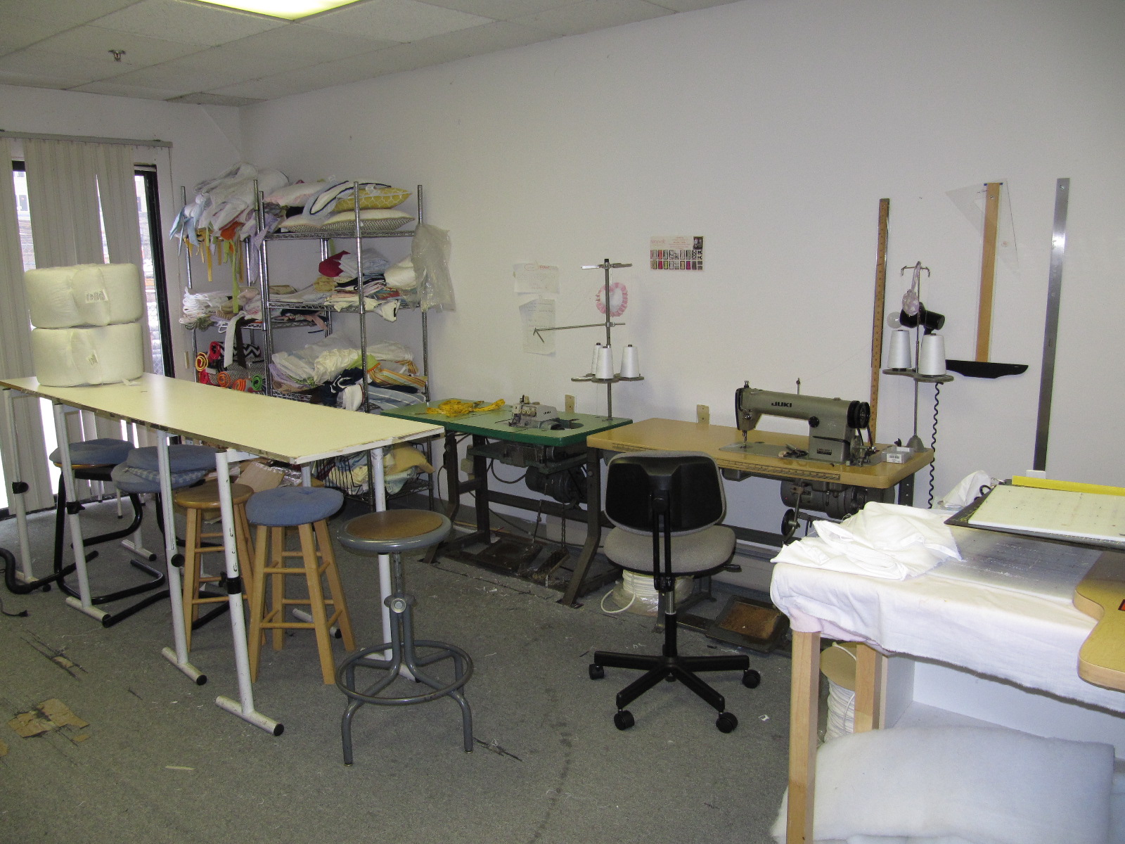
Her very efficient and organized workroom...

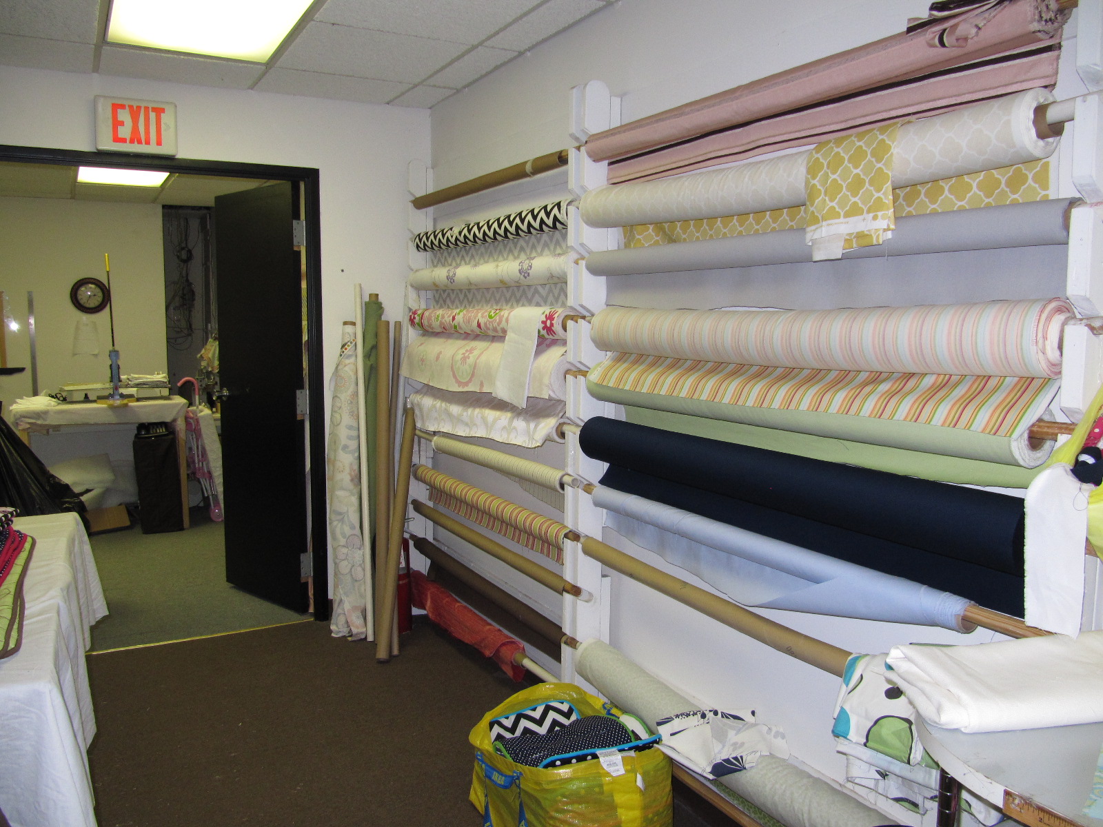
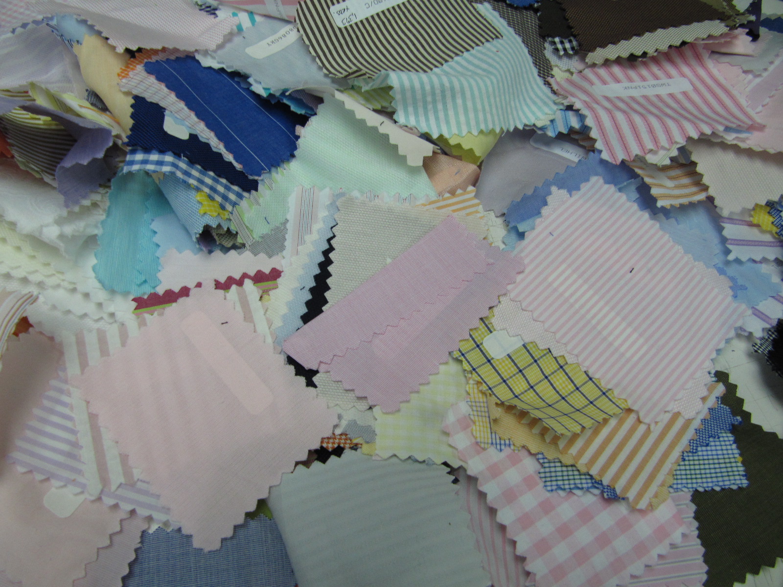
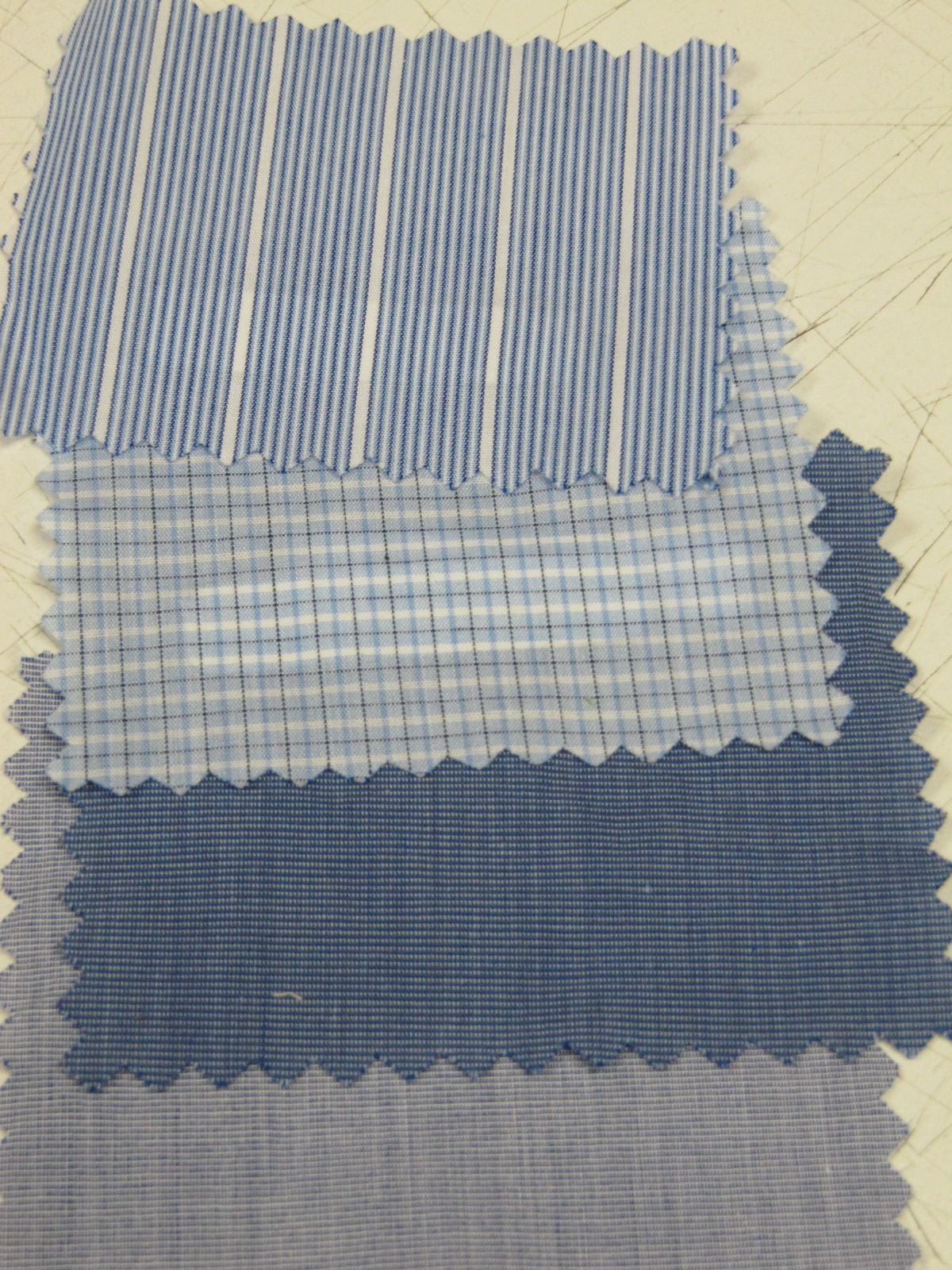
Some inspiring classic fabrics ...

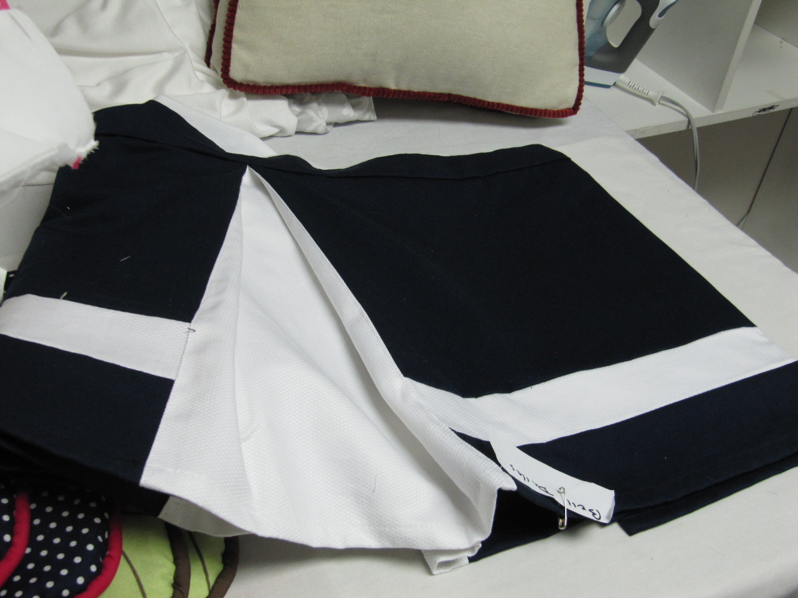
Creating very classic bed skirts...

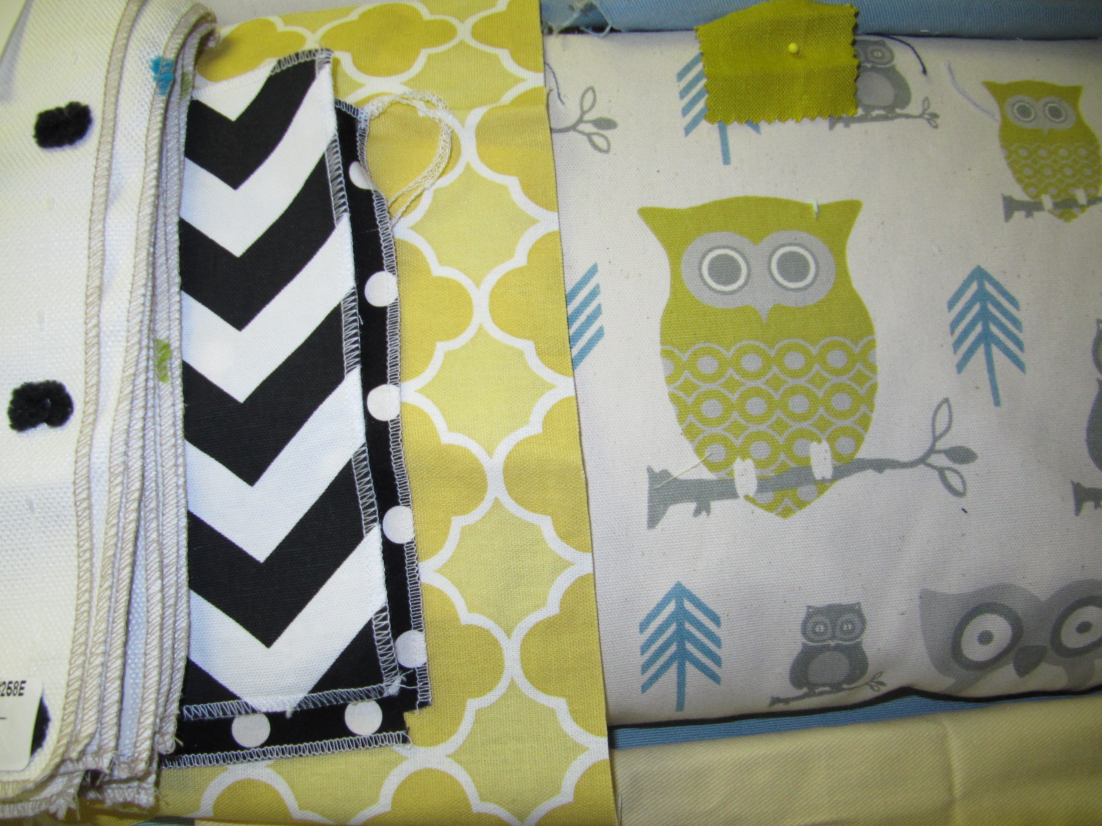
New looks being put together..

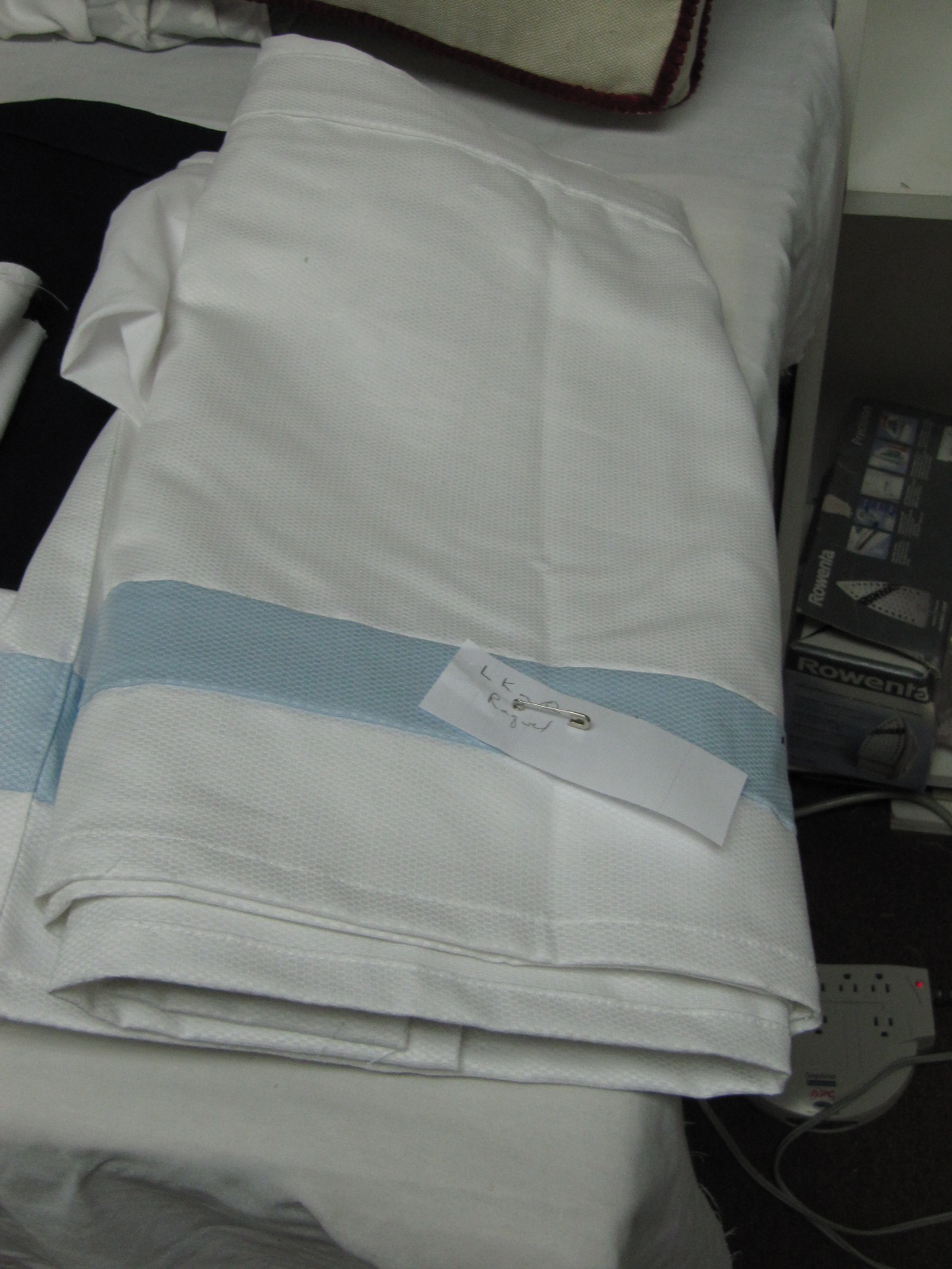
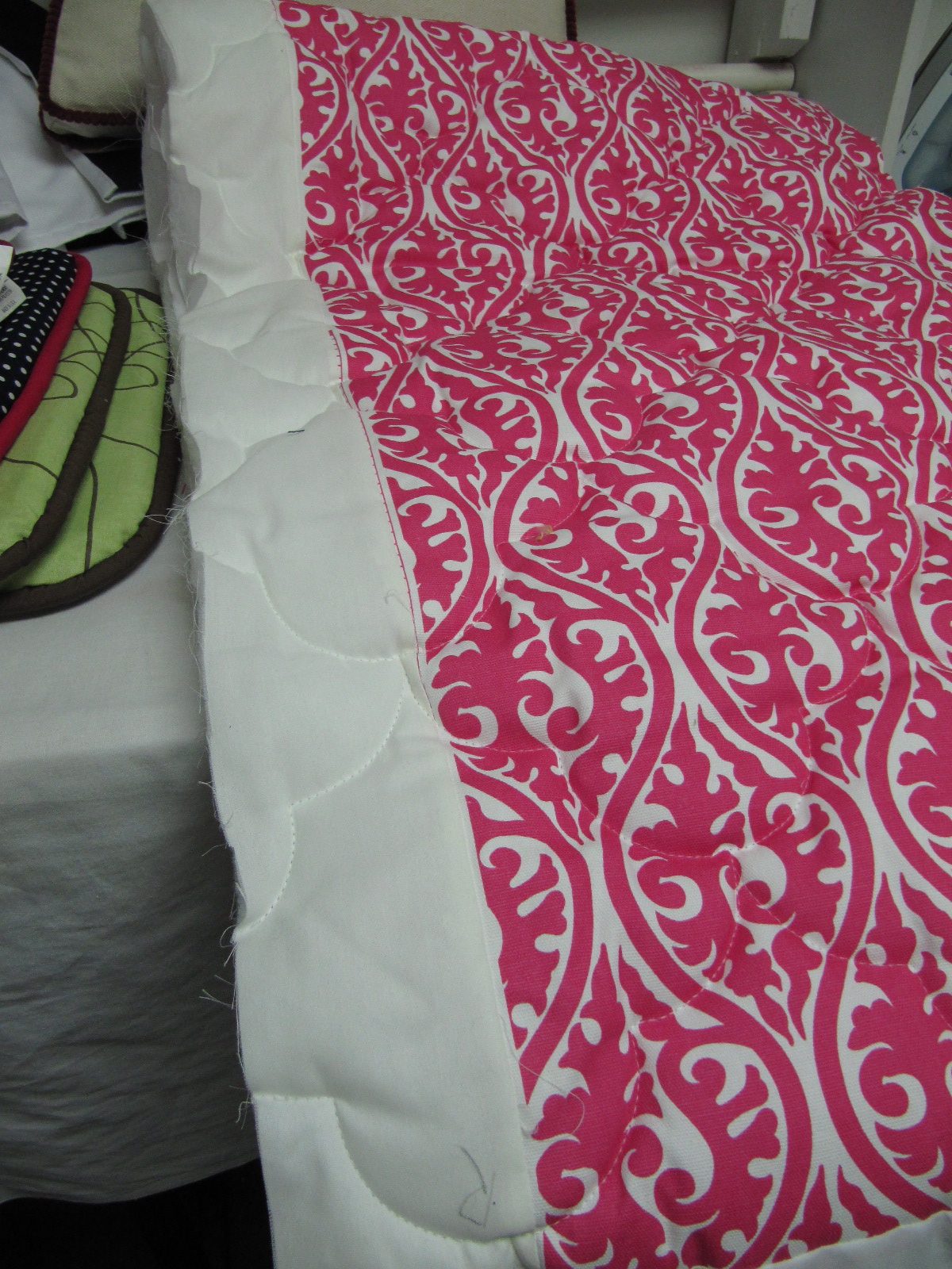
Some customers prefer quilts to duvets. An example of their quilting...

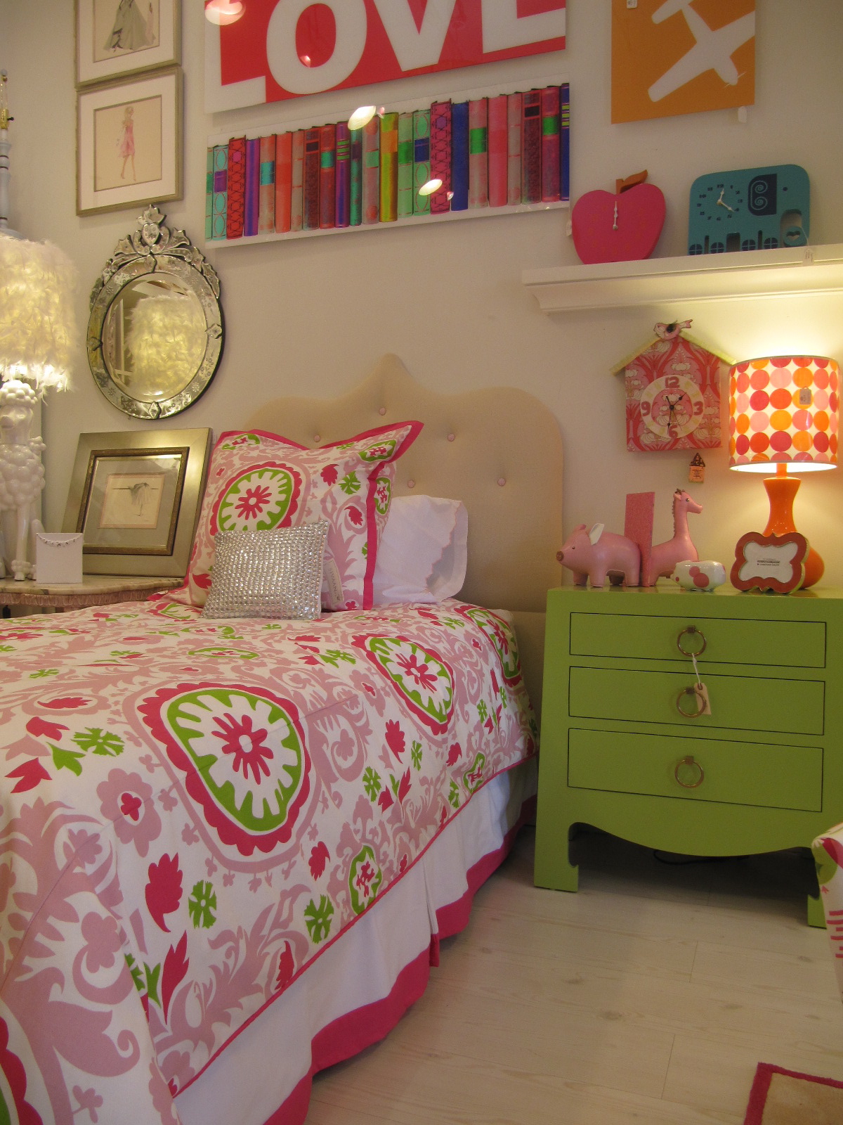
I picked a fabric for my new Spring bed...

Can't wait to see how it turns out.

See you... Christina

Warhol and the Poodle Part II

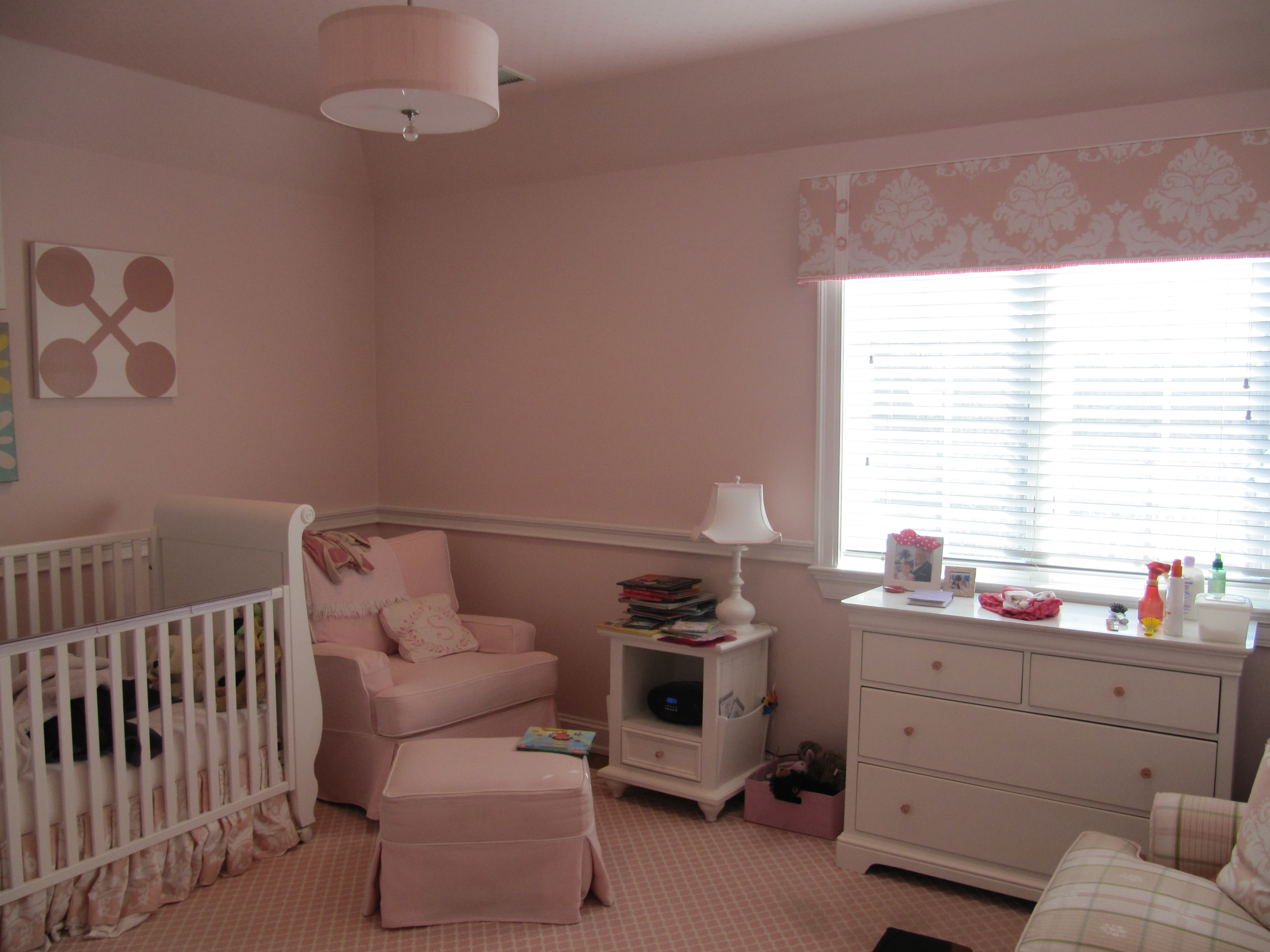
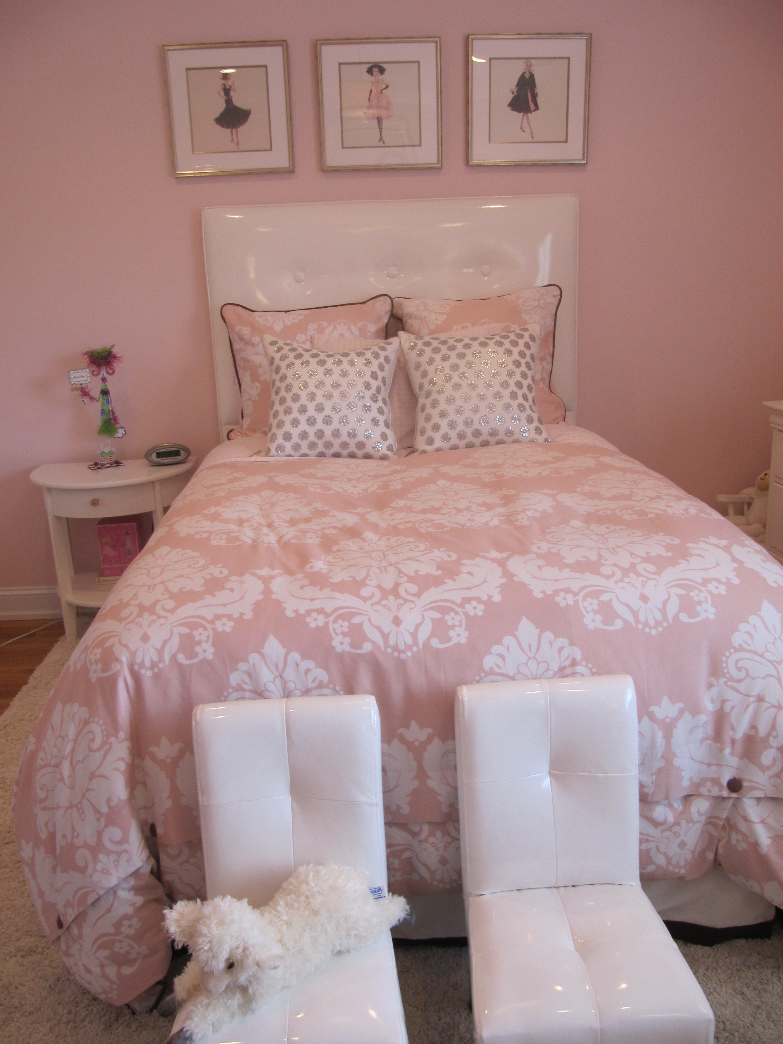
We finally got some good pics of the client that had the Warhol in her little daughter's room!  See  first post. Just to reiterate, her daughter was moving into a big girl's bed and the mom wanted to make her room a little more hip. The mom didn't want to change everything about the room. She already purchased the big girl bedding.  The window treatments and some furniture would remain as well.

The first thing we did was remove the chair rail. No more crib. A big girl bed was in order.

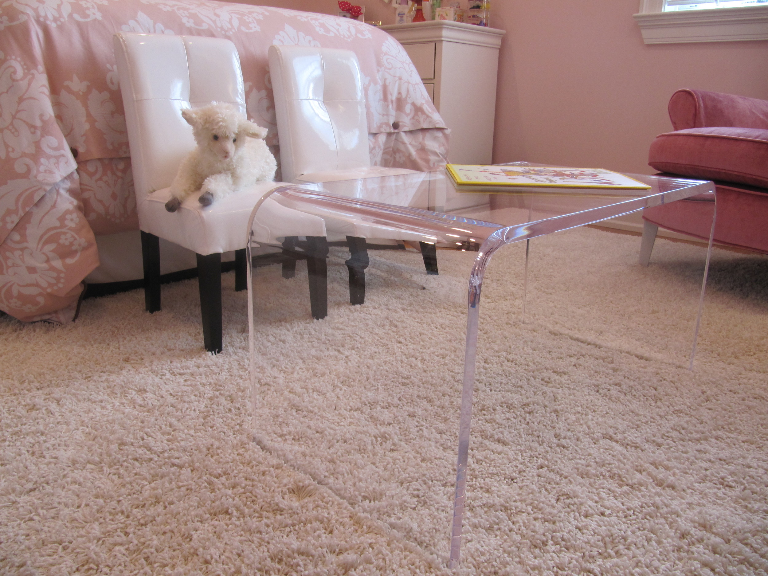
The little coffee table was custom sized so the little girl can use it as a table with her little chairs.  The chairs also have double duty as a step stool to get in  and out of bed.

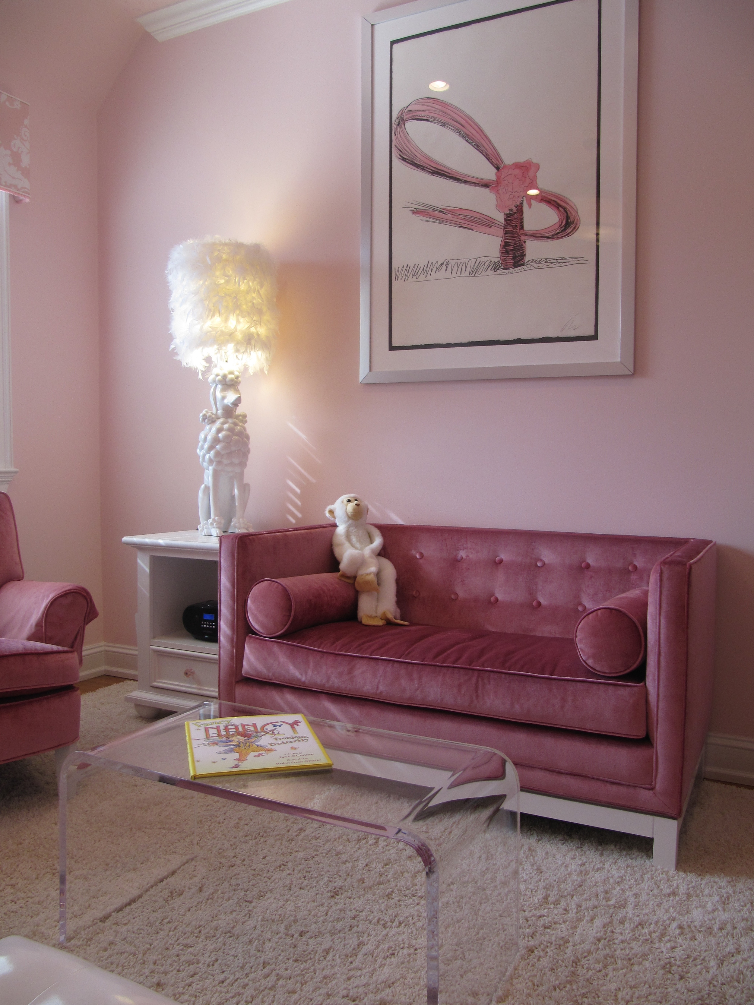
The  sofette fits nicely in the space.

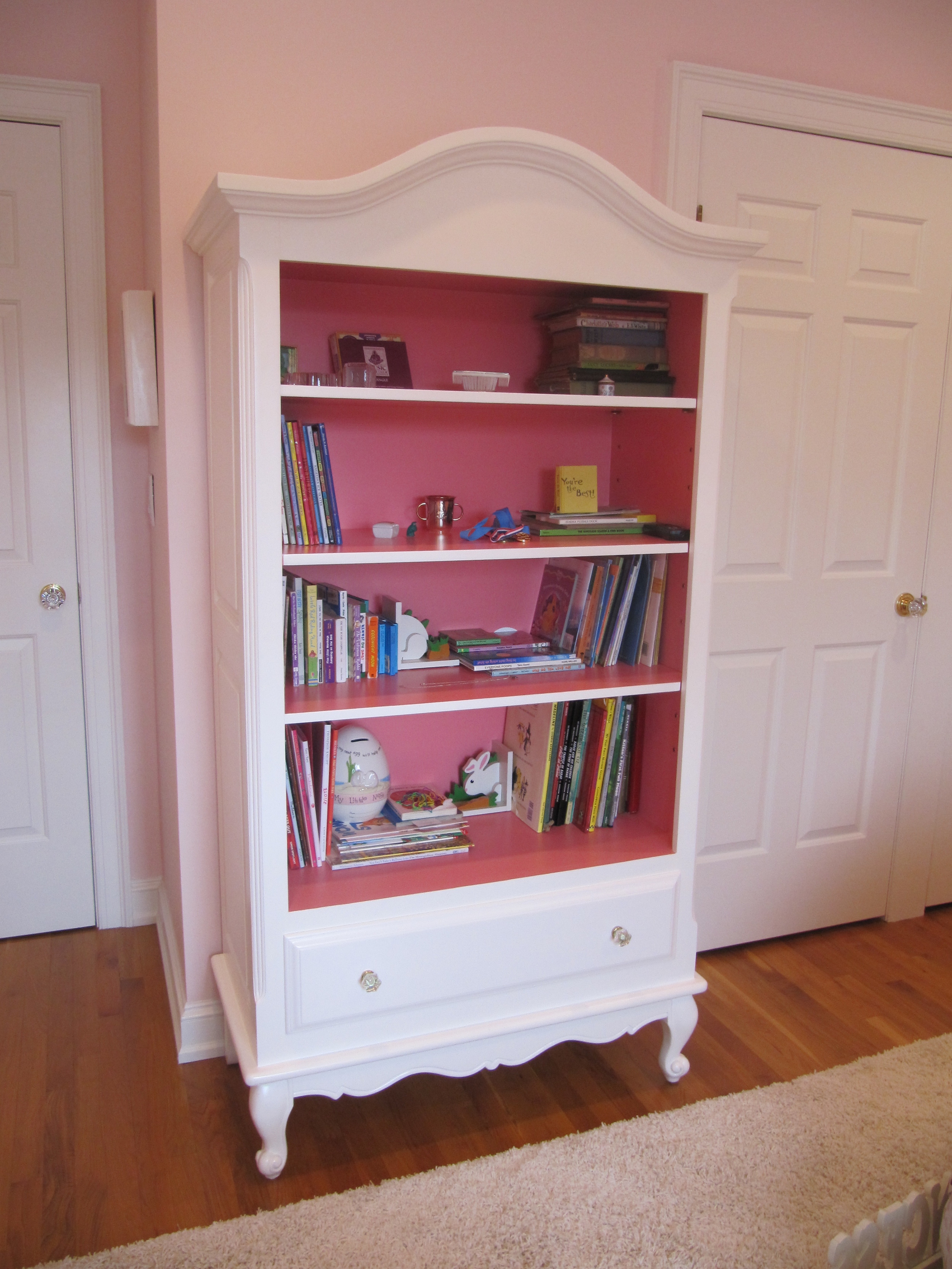
She needed a pretty, but bookshelf for all her favorite things...

A real pop of pink make it oh so sweet..

But her most favorite thing is the poodle lamp!

See you..

Christina

A Ray of Sunshine

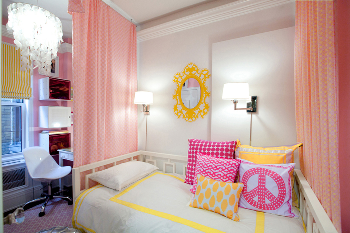
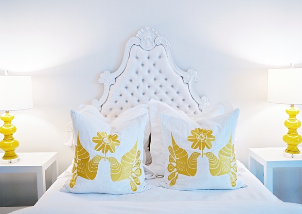
When I was a little girl, my favorite color was yellow.  Bright, sunshine yellow. A customer wanted to put a little zing in her daughter's bedding to fit her personality. She wanted it to be simple with a splash. We chose  Serena and Lily's  classic bedding in berry with yellow marni euro shams and a great bolster made by Bebe Chic.

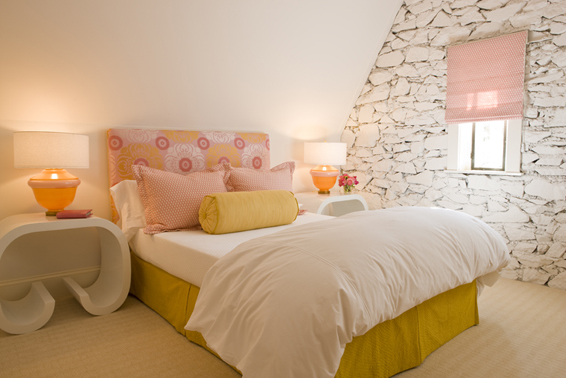
A touch of yellow is just so lovely. Love these rooms...

Lily Z Designs

Palmer Weiss

See you...

Christina

Warhol and the Poodle

It is true that our tastes change over time. I am seeing more clients that would like to refresh their current, relatively newly decorated rooms. The rooms are currently traditional, but they would like to make them more transitional. Add more modern. Give the room lightness. Add something that is unexpected. Ok the last sentence is my theory.  My current client has a little girl that is growing out of her crib. The nursery was very traditional. We will have to keep some of the furniture from the nursery.  Her  crib bedding, named Greta,  was from Serena and Lily. All very lovely.
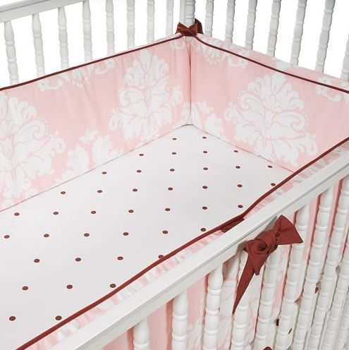
The pink in the Greta bedding is a bit dusty. It is a tough pink to work with, since it is hard to find complementary pink fabrics.  The old decorator made a valance out of the same damask pink fabric and the walls are also the same pink. Lots of pink!

Realizing how difficult the pink was to match, the mom bought the complimentary sheets for the big girl bed in the same Serena and Lily pattern.  Called Gracie, Serena and Lily has since discontinued it.
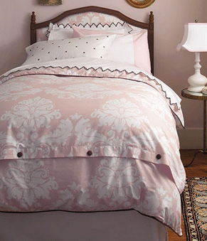
So now, my job is to change the nursery into a little girl's bedroom  and add a modern feel to the space. So lucky that this Gracie bedding  can easily harmonize  with some modern elements.   The mom also  bought this fun Andy Warhol print that we will use as inspiration.

For the bed, I would like to do a high headboard upholstered in white faux patent leather.
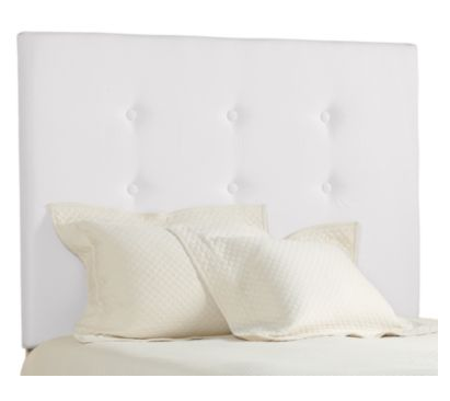
I found these pillows at the last gift show that will add a little sparkle to the bedding. They are so delicate and sweet. From one of my favorite companies, Sivaana.

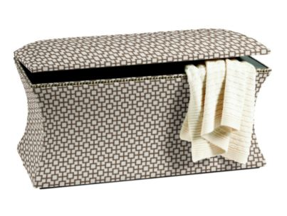
At the end of the bed I would like to put this upholstered  brown and white linen storage bench .
We will keep the nightstand.

I found a crazy fun lamp to put on it.  We may change out the shade.  But how fun is it!

We will keep the simple white dresser

And add this mirror.

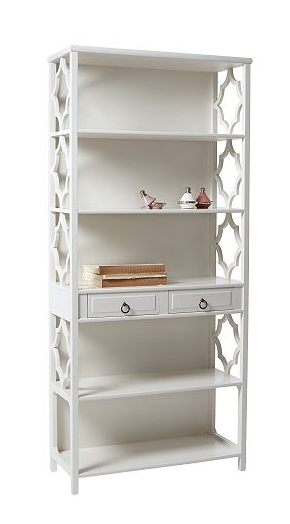
A nice bookshelf is needed...
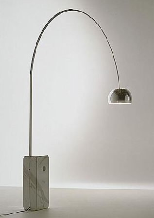
A loveseat will sit underneath the Warhol with a very cool fixture
I wish I could blink and it would be done. How easy that would be....

See you...

Christina
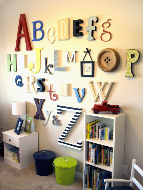
Alphabet decorating for a nursery

I found these brushed aluminum letters at a flea market not long ago. They are quite large.  The dealer told me they came from  an old car dealership. The letter A went into a little boy's bedroom. We mounted the A on top of a large aluminum framed bulliten board. I still have the letters F and C. I wish I had more. The font is so simple and clean..

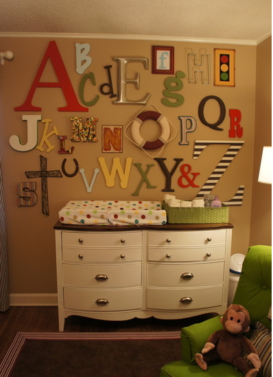
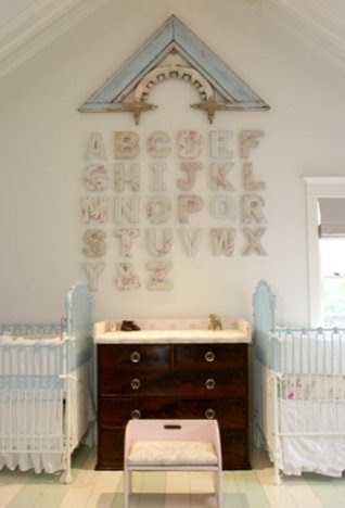
Collecting letters and putting them up thoughtfully can be a really fun way of decorating a nursery.

Shabby chic letters in a shabby chic nursery...

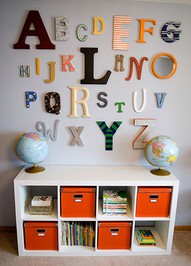
You don't need an entire alphabet to make an interesting statement. Just begin by collecting the odd letter at a flea market and look what you can create...
This is one of my favorites...
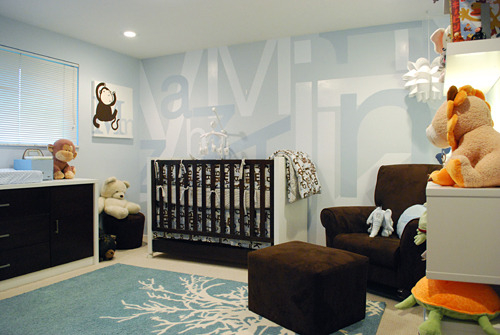
This is no ordinary mural in this modern nursery...

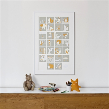
At Cici Crib, Binth's alphabet poster is oh so stylish.

This print has alphabet whimsy..

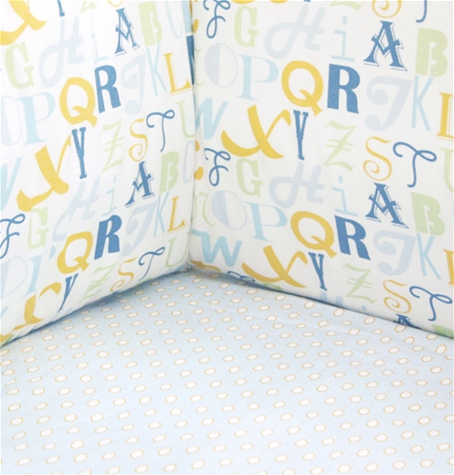
Crib bedding with an alphabet pattern.

Many different alphabet directions.

See you..

Christina

Art for a little girl's nursery

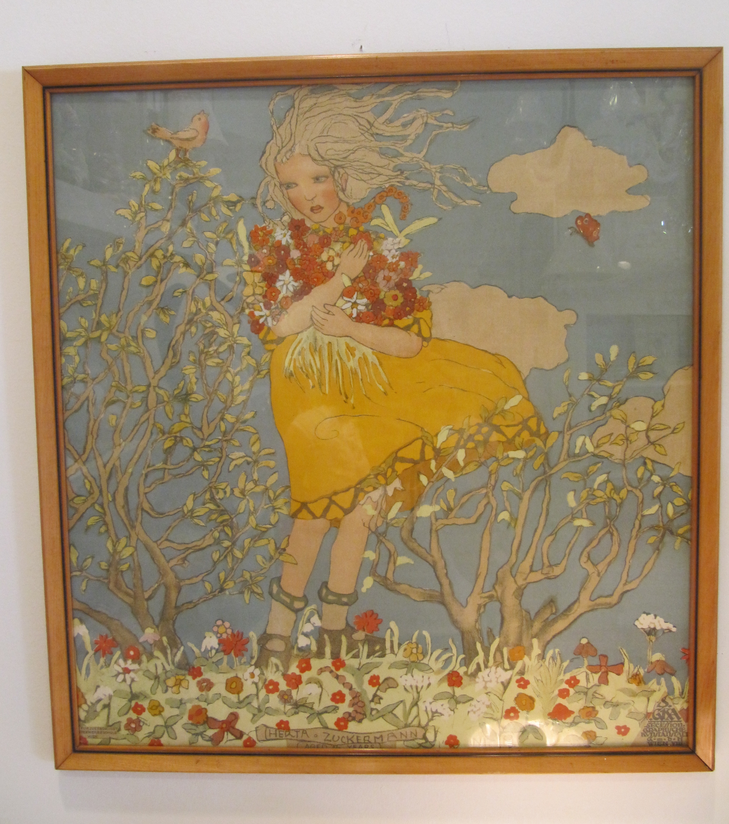
This Viennese lithograph came into the shop this week. It dates back to the  turn of the century and is in great condition. Colors are clear and the size is quite large. It is absolutely lovely.  It appears that the  young subject is  Herta Zuckermann.

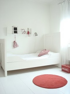
This picture would be a lovely piece to use as inspiration for a nursery or little girl's room.  Maybe create  a little nursery  with European feel. Children's rooms in Europe seem far more relaxed and playful, but not cutesy.

Some  Swedish rooms from Lila Villa Vita   Blog

Vita Nyanser's blog has some sweet children's rooms.

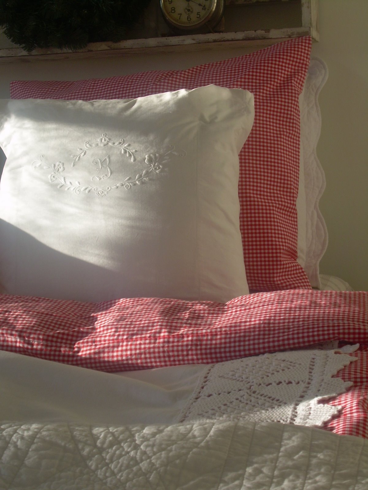
Lot's of old linens and quilts could be used to create a very cozy space.

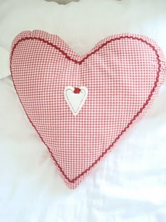
Simple crib bedding using white pique fabric and a little red gingham piping would work nicely.

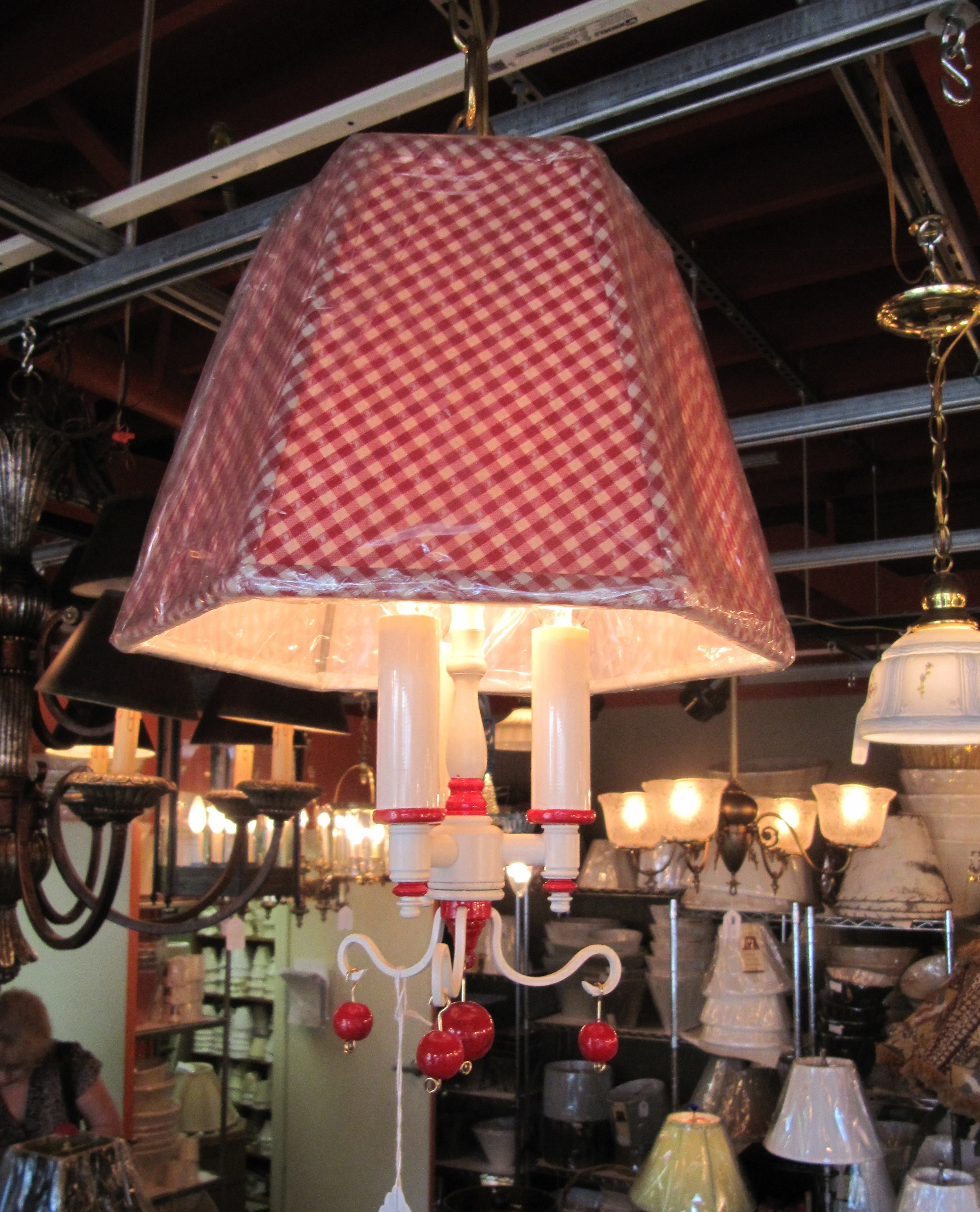
I saw this light fixture in Pittsburgh last week. That would be sweet to use.

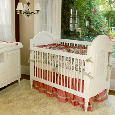
If it is a traditional nursery then we definitely could use this crib from Newport Cottages.

How one picture can inspire the decor of the entire room.

See you

Christina

Love the dot

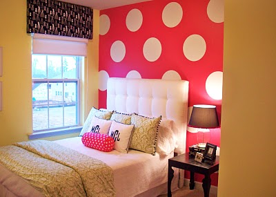
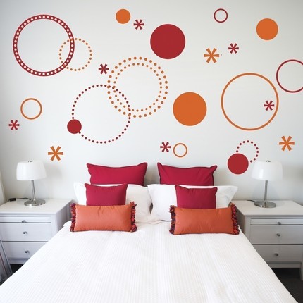
Sometimes when I mention polka dots as a decorating idea, I get a groan from my customers.  Yes, it  has been over used. Dots on the bedding, dots on the window treatments, dots on the rugs, and painted dots on the walls. Too many dots! Seen too many times.  But that simple circle can be quite inspiring. Check out Emily Clark's little girl's bedroom. Aren't those exaggerated dots fantastic? It sooo easy. You can just paint the wall  and use the wall stickers to make the circles.

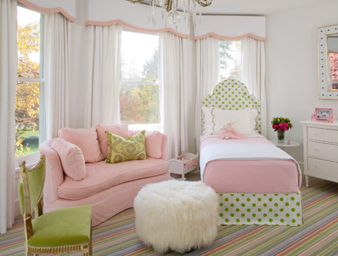
A little more of a classic polka dot for this little girl who loves pink and green.

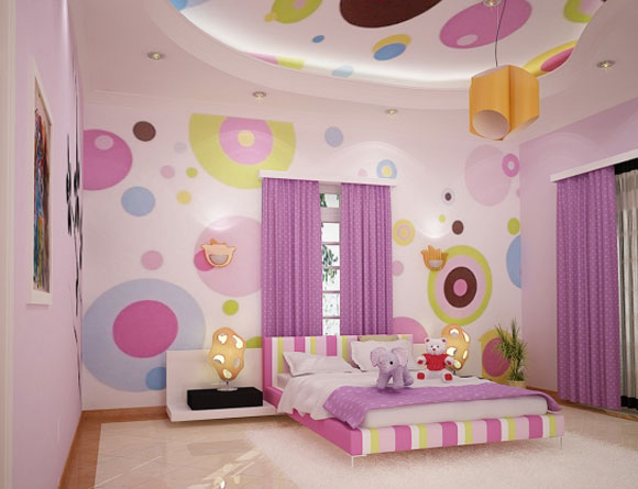
Love the oversized dots..

Another room that used wall stickers.

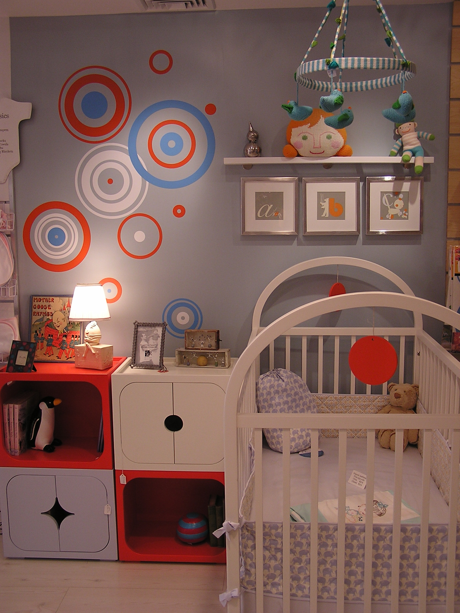
See the dots in Cici Crib that are also wall stickers.  Easy decorating for a nursery.

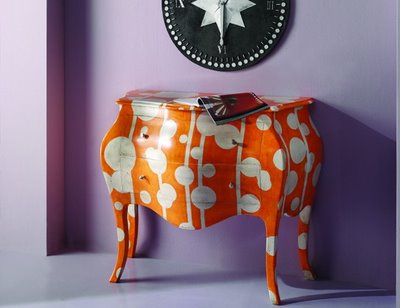
A painted chest of drawers in a bedroom or nursery can create a nice statement.

A simple shade in polka dot is definitely not overdoing it.

Polka dot decorating is endless. Just don't overdo it.

See you.

Christina

Overflowing with Flowers

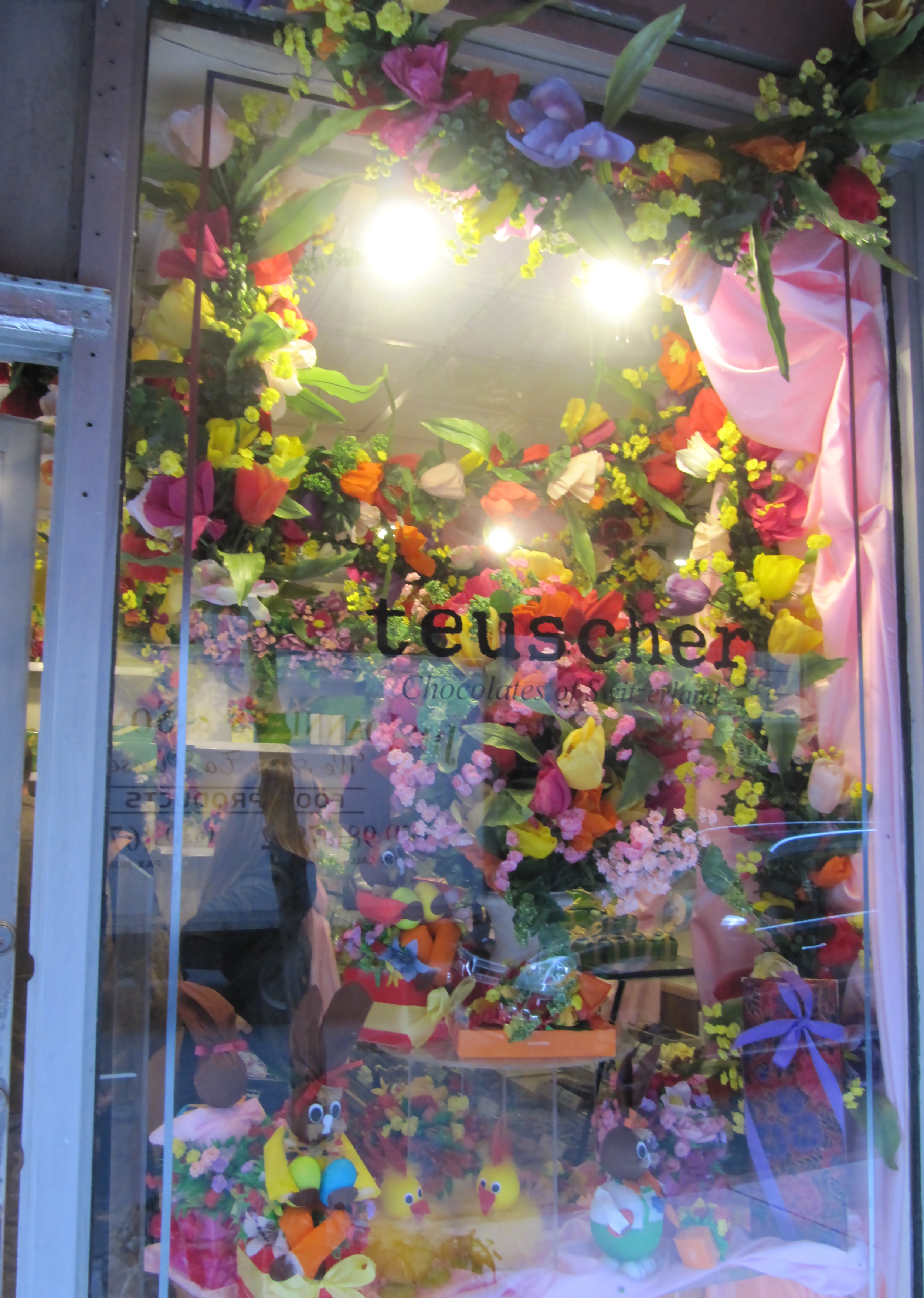
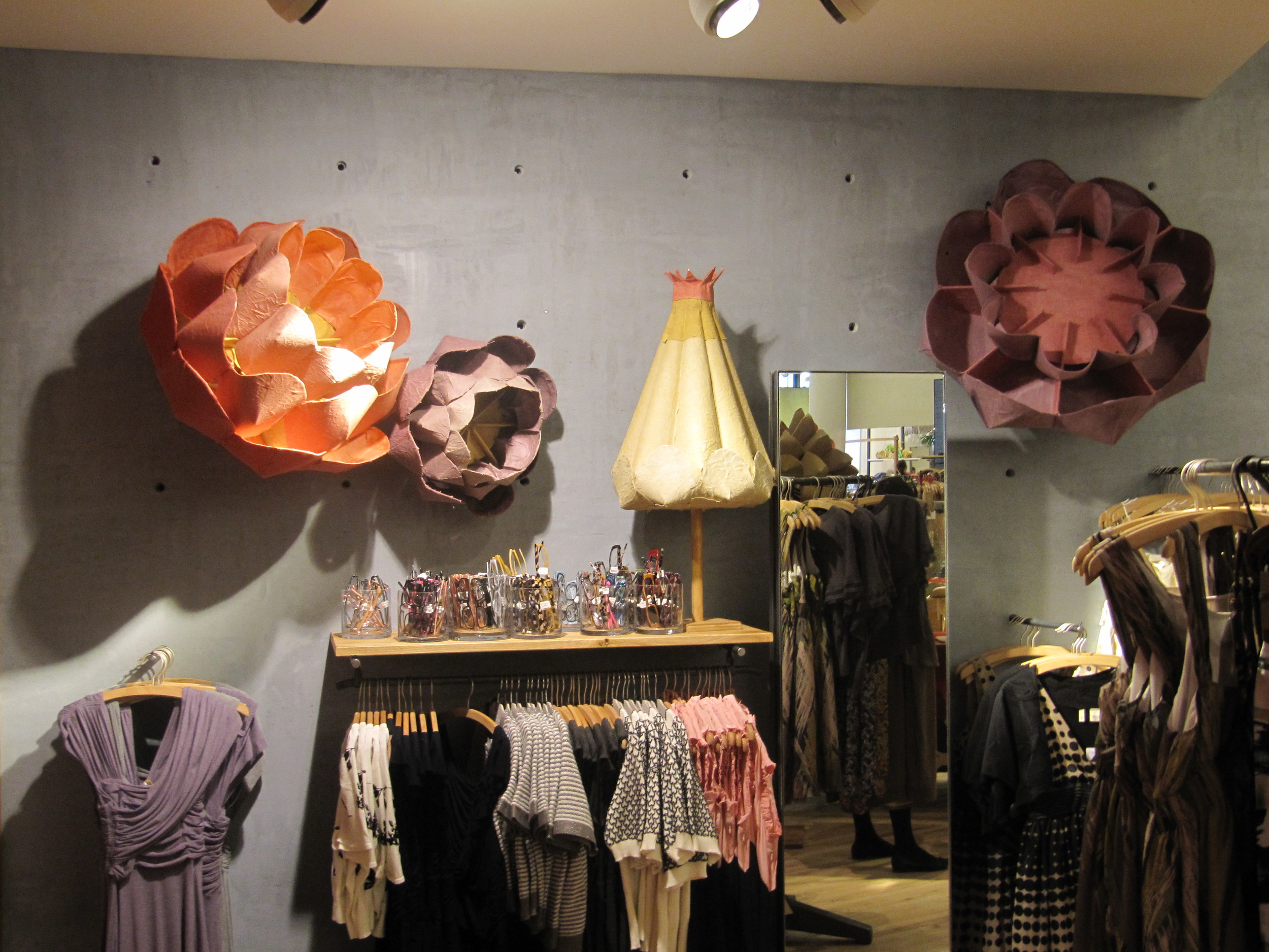
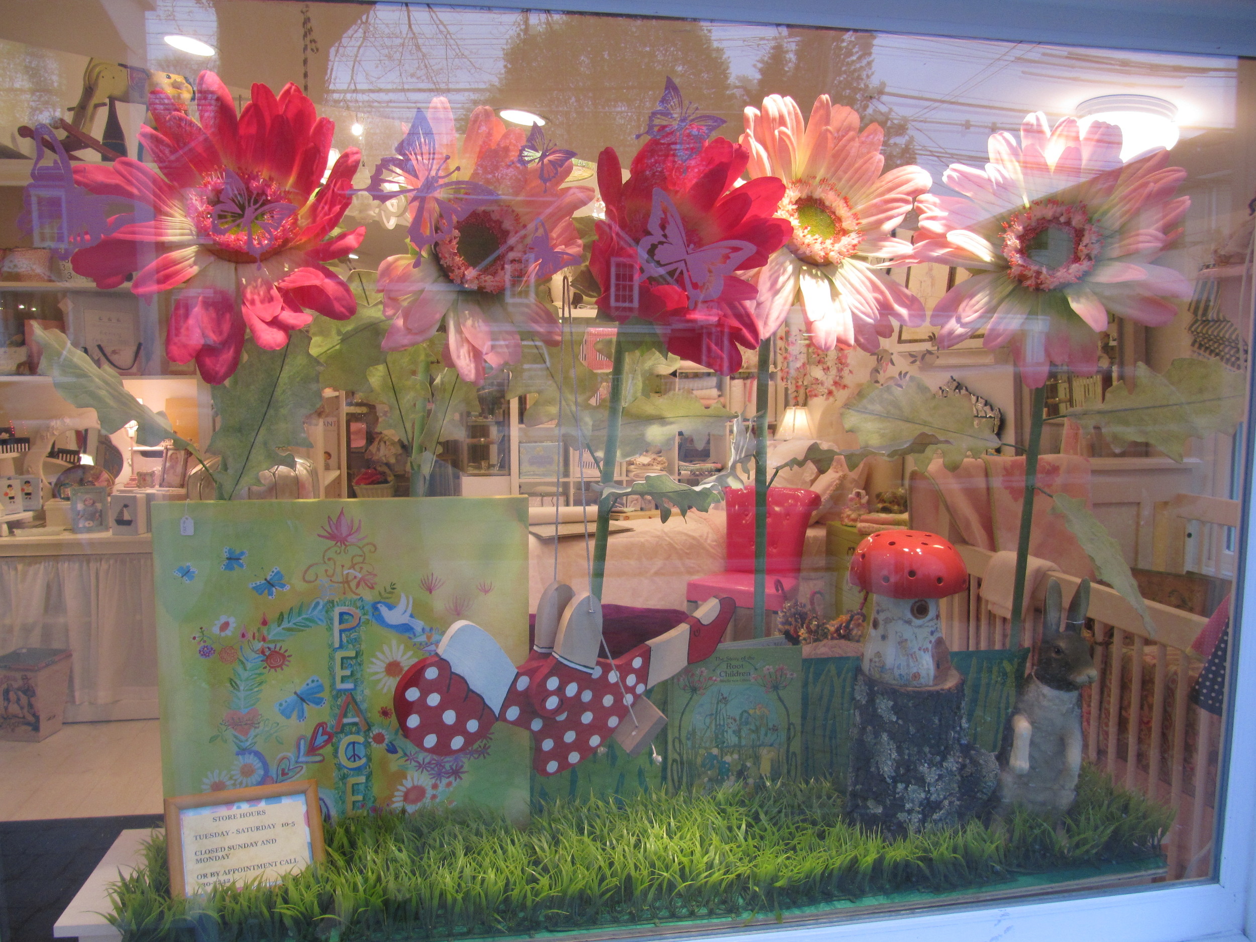
Flowers were bursting in many store windows around the city last week.

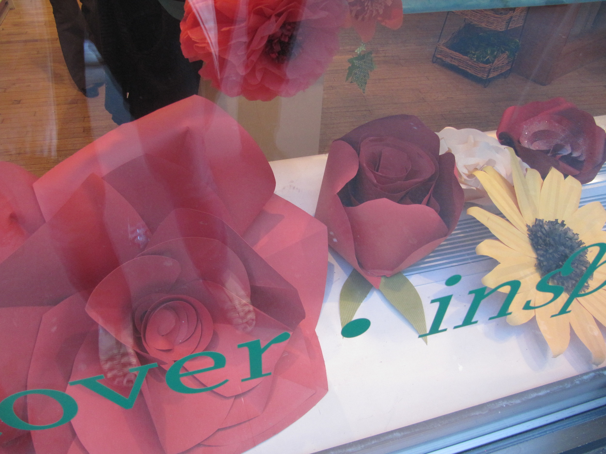
Fantastic paper flowers in Kate's Paperie in Soho.

Completely covering the window at the tasty Teuscher.

Anthropologie in Chelsea showed some  enormous playful  looking flowers. Looks like they were made out of paper mache.

Even Cici Crib has an overflow

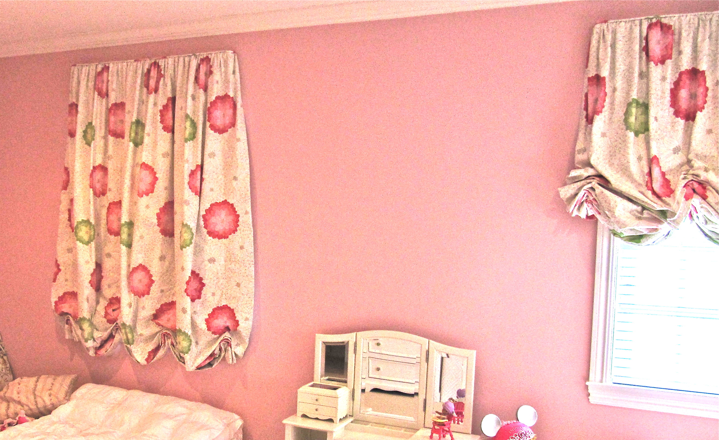
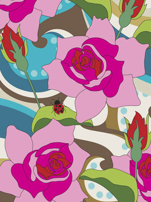
Inside there were lots of flowers to discuss. Bedding for a little girl's big girl bed  is inspired by   the nicely exagerated flowers on the fabric of the window treatments.

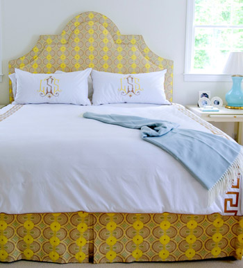
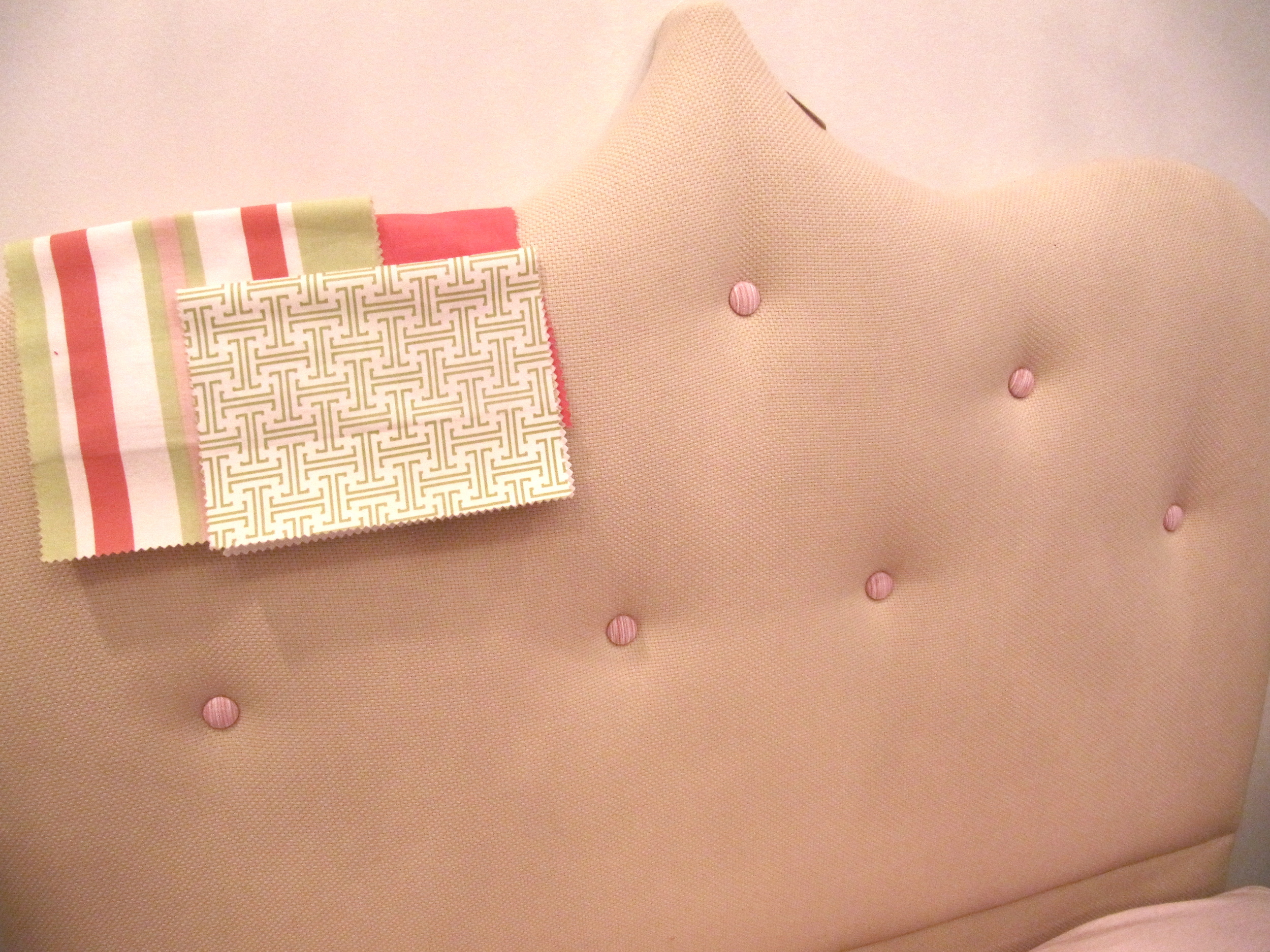
A possible combination for bedding and a  headboard  to complement the  flowery treatments.

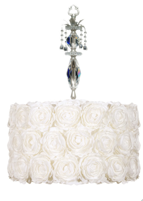
Another customer wanted to look at light fixtures that were not chandeliers. It is her third daughter. The first 2 had lovely chandeliers in their room. So we came up with this white rose wrapped  fixture from Maura Daniel.

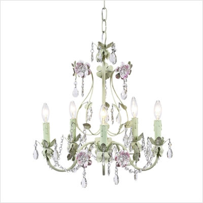
After 2 sweet sons, another customer is awaiting the birth of her first little girl.  For her nursery, a delicate floral chandelier was in order..

An then there was the Mom  looking for art for her tween. Art by Jacqueline Shapiro for Oopsy Daisy.

or maybe

Lot's of different styles but one focus, flowers...

See you.

Christina

Soft Cuddly Nursery

I  went to the Stark Warehouse Sale down at the Metropolitan Pavillion looking for a few things. I didn't have much time, but I found some really cuddly, soft, yummy rugs that would be great in a nursery. Like all the blankets, stuffed animals and layettes collections in my shop,  the very first purchasing  criteria in  is the softness factor.  This shag rug was like a cloud.

This rug looked like a pebble path, but is made completely of wool.

This rug looked like a bunch of packing peanuts.

Ok so the rugs aren't the most practical. But given their texture and feel, they are definitely a nesting contender.

So now I am thinking soft. What are the softest things in my shop.

The softest light fixture is the one coming in the shop in April. It is a small version than what is pictured. Chihuly inspired..

Number one mobile is bla bla's The colors are gentle and the lambs are just so sweet.

It's really hard to pick the softest bedding, but today I think it is Lulu Dk baby bedding. 500 Thread count. That lovely cotton sheen. Really stylish and sooo soft.

I would be completely remiss if I didn't mention Lotus Springs layette collection made from milk fiber. I don't think there is any softer.

And finally the softest stuffed animal is by Jelly Cats Bashful Bunny:

See you.

Christina