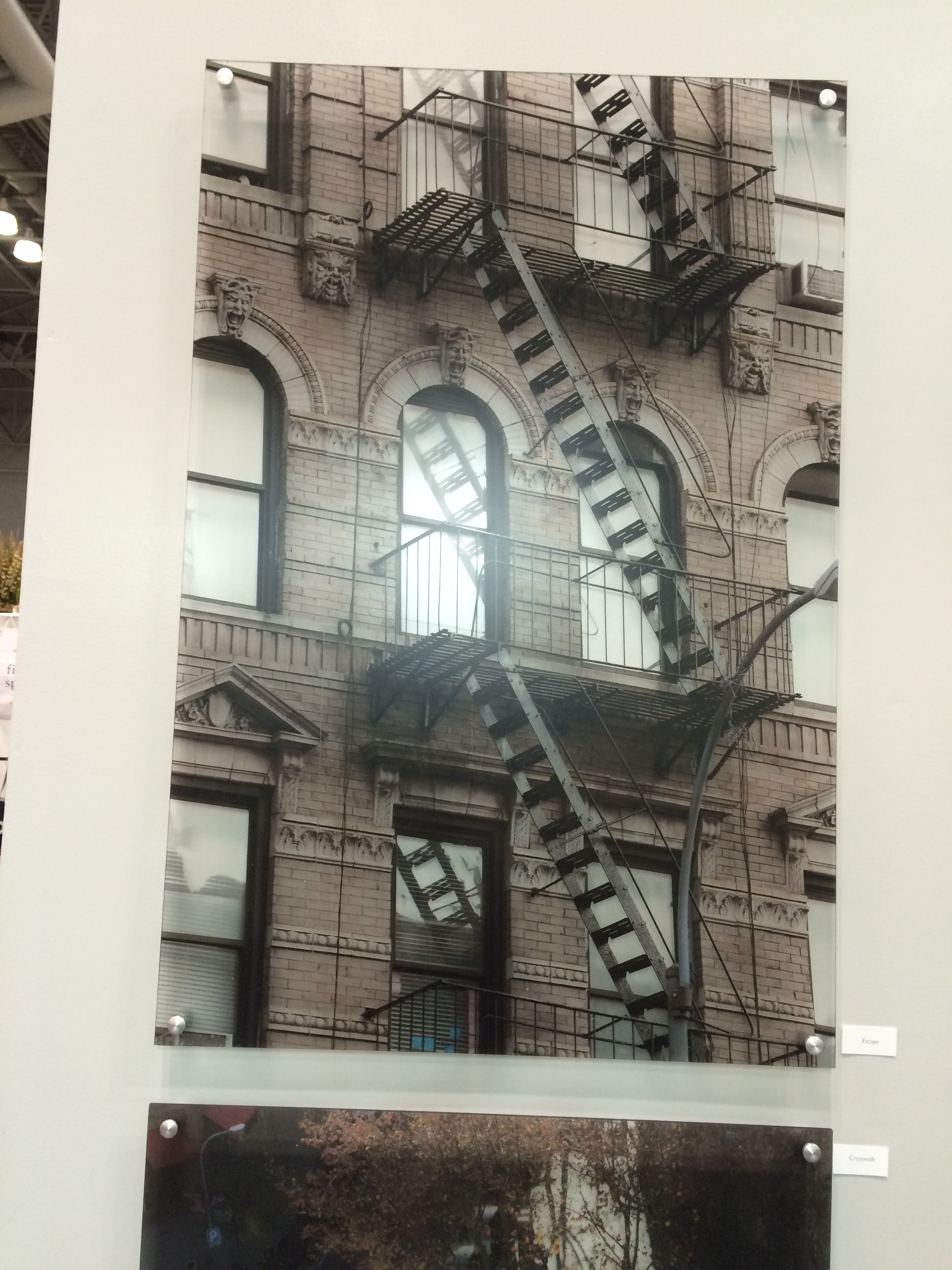
Just a sneak preview of the before and after of my townhouse in the Mexican War Streets in Pittsburgh. It's nice to be settled in!
Your Custom Text Here
Just a sneak preview of the before and after of my townhouse in the Mexican War Streets in Pittsburgh. It's nice to be settled in!

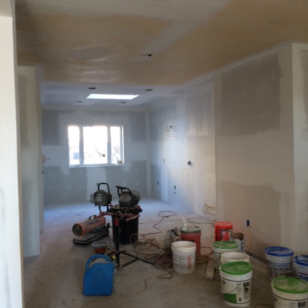
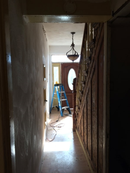
The house is starting to feel more like a house than a construction site. Well sort of anyway. Walls are being smoothed out. Tile is down. The wood floorand entry tile on the main floor has been laid.

In keeping with my concept of a light, bright ,warm space, I decided on a white washed oak floor. There are purposeful imperfections- a shabby chic floor for sure. I didn't want the floor to look shiny new next to the well worn staircase. I know the white floor is gutsy design decision in this historic district. It will be laid next to the staircase which will be stained as dark as possible. I love that contrast!
The lovely entrance floor above, a beautiful marble from Italy, is a Walker Zanger tile. I purchased the tile at Tile and Designs in Shadyside. Their selection of tile is exquisite.
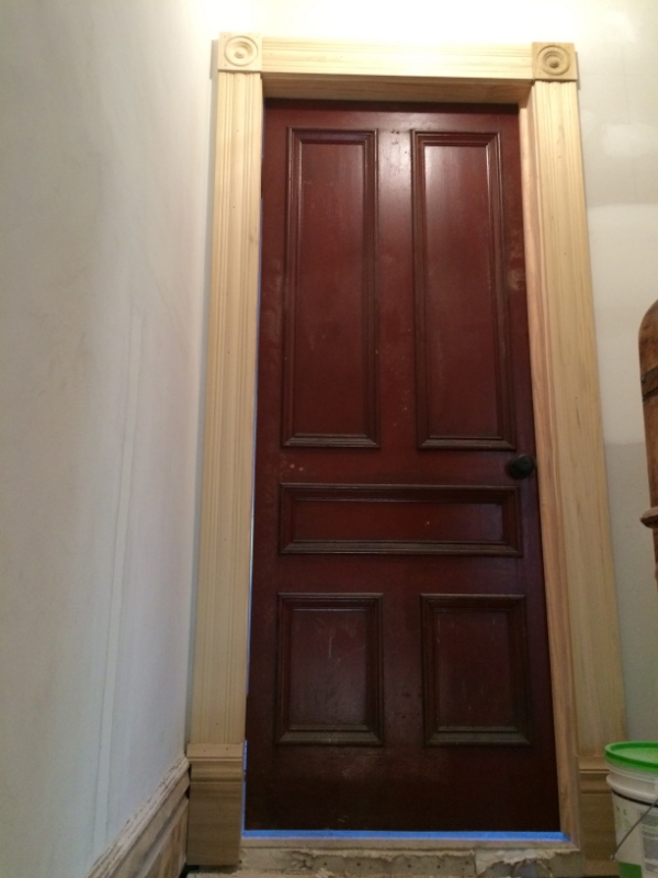
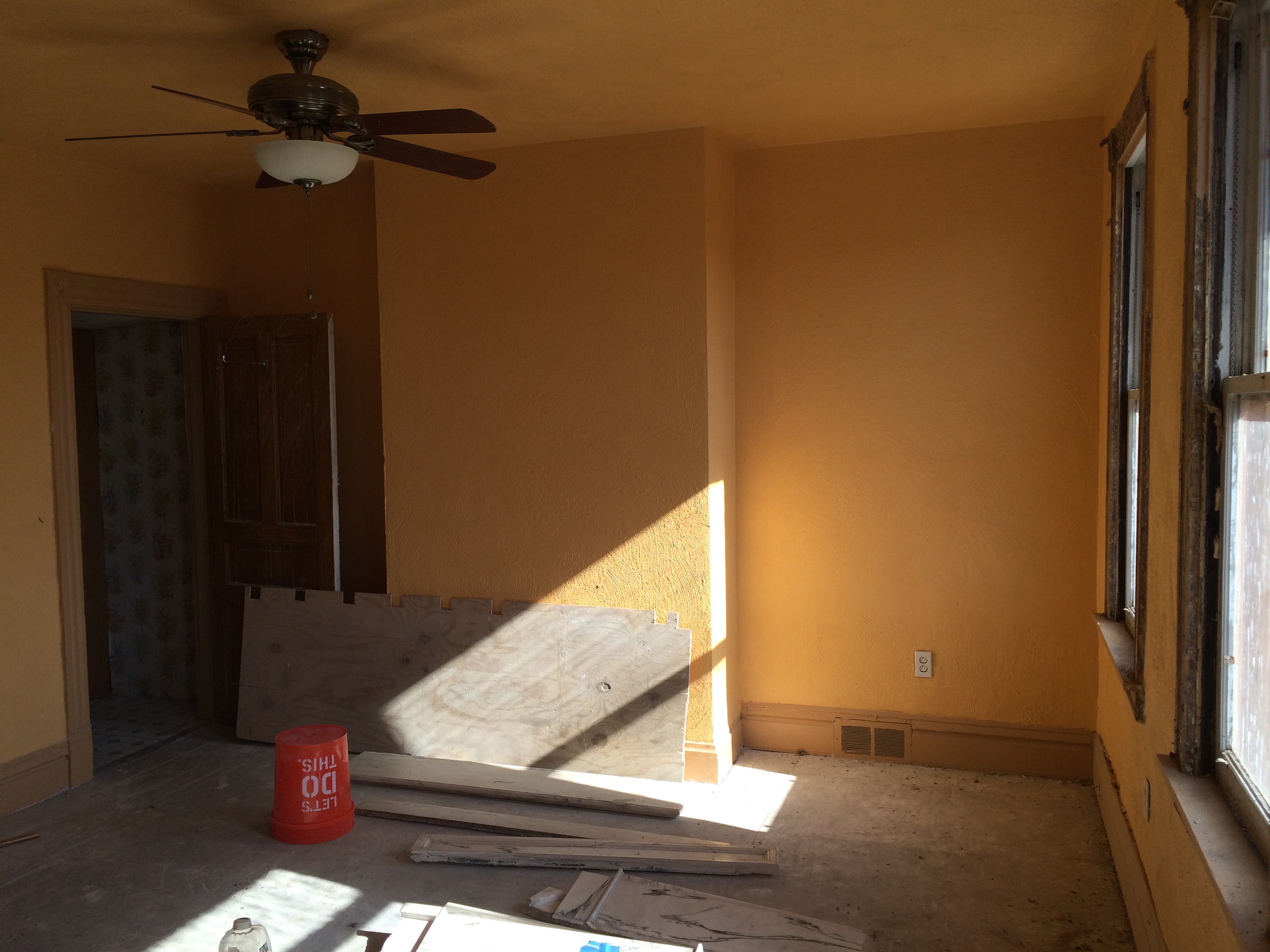
Most of the trim and casings in the house were removed after the many renovations that occurred over its life. There is a bit left. The pic below shows the original casing that is in the process of being stripped and sanded.
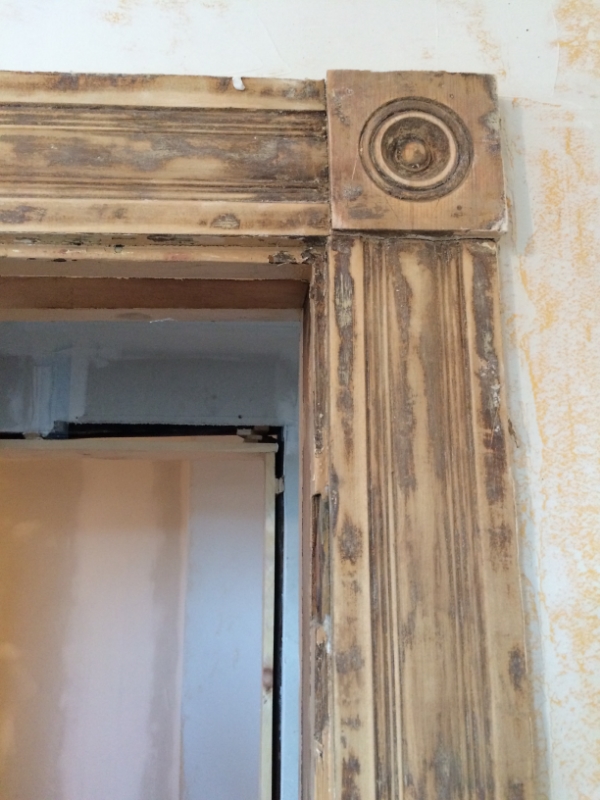
I found new casing and rosettes at Allegheny Millworks in Pittsburgh. It isn't exact match, but I felt it was close enough. I can just hang outand check out all their beautiful woodwork at Allegheny Millworks. I love that place.

I found this beautiful cherry trim for the first floor. It's chunky and gorgeous.

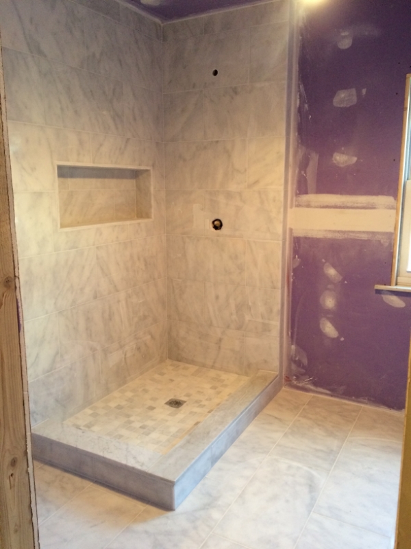
The master bath tiling is complete. It is all in carrera marble.
Exterior work is going on as well. The new siding is going up on the back of the house! I decided to use Hardie Plank siding. It's a great alternative to wood. I chose the Hardie color of cobblestone for the siding with white trim. Here is a pic from before. Notice the very dangerous balcony. The house inspector refused to step on it.
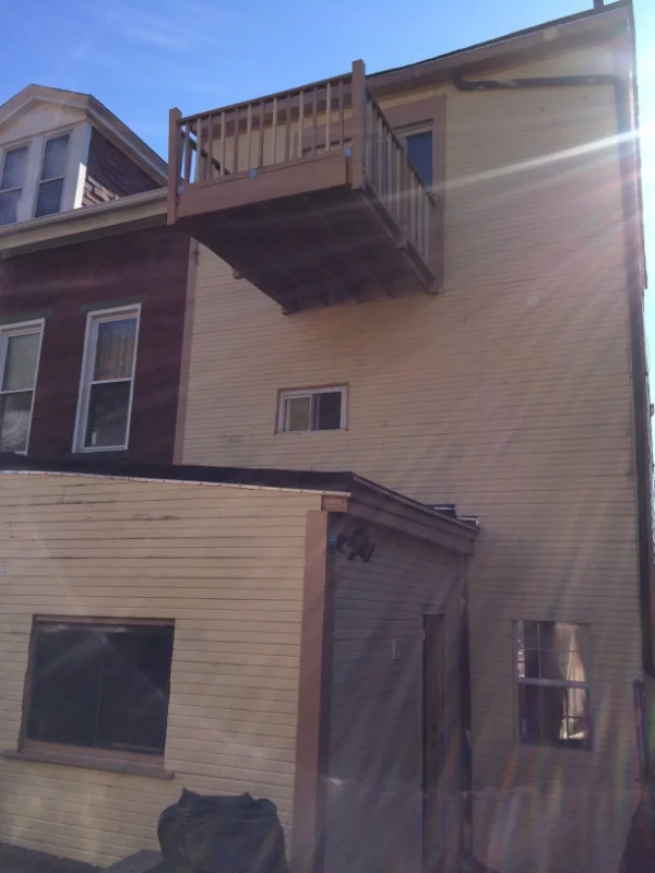
The balcony is now a Juliette balcony and all siding and windows are new.

Well that's about it for now. Thanks for looking.
See you...
Christina
I was back in NYC looking at a clown shoe collection while work was progressing on my Pittsburgh townhouse! I was sourcing some stylish accessories to decorate a Madison Square Park duplex, but these didn't quite make the cut, unfortunately...


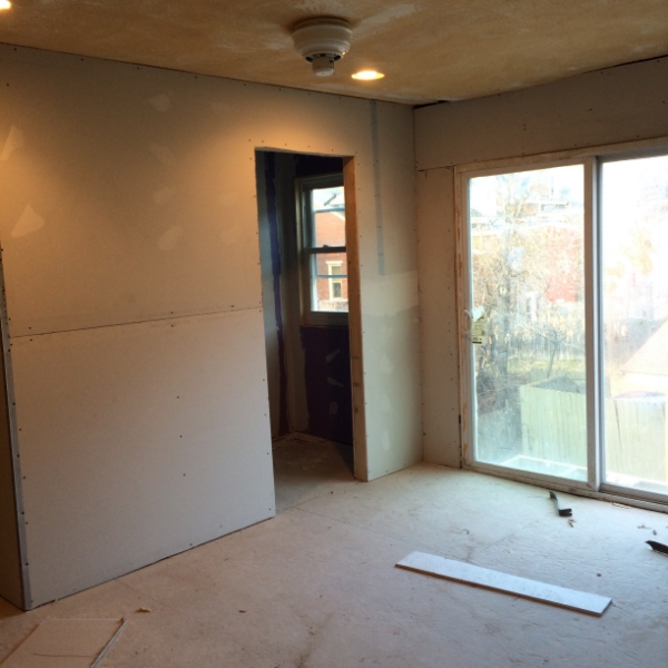
Back to the renovation- It's moving at a fast pace now. All the dry wall is up and the mudding is in full swing. I expect this part of the project to take forever since most of the house was covered in popcorn. Not only popcorn ceilings, put popcorn walls! Lots and lots of skim coating!
One of my favorite spaces is the kitchen. I love to cook and bake! It is not a large space and so architecturally insignificant as most kitchens were in the 19th century. I wanted it to be the center of the living space. This is what it originally looked like.


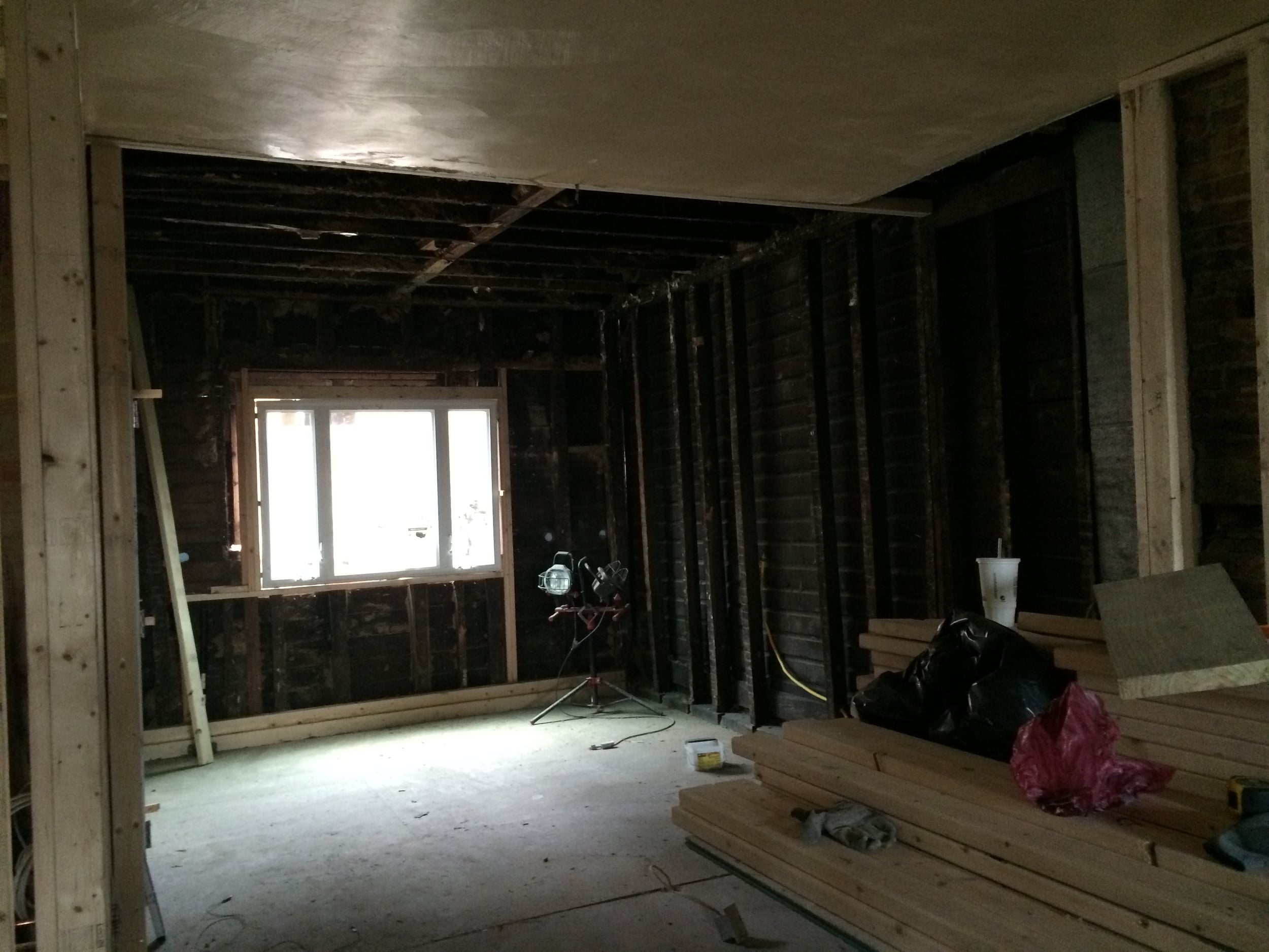
We completely opened it up. The ceiling was a bit of surprise. We thought it was a standard height. Once the demo started we realized we could raise it to the height of the rest of the first floor which is about 9'. Now it is an integrated space. Light flows in from the larger window as well as the sky light. All the "lovely" stone was removed and sheet rocked.

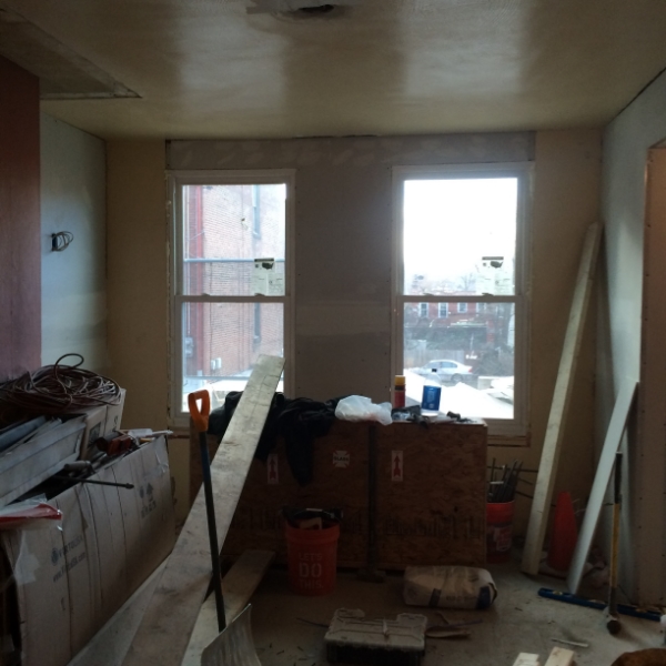
We removed that large awkward window in the living room below. It was replaced with two proportionately sized sash windows.
Now the space is completely open and light. Behind the staircase we snuck in two closets. A coat closet and a pantry. Closet space in these townhouses are rare. I would love more storage, but I had to be mindful of the petite, narrow proportions of the house itself.


In the above pic, I found an antique door for the powder room. The knob is black porcelain. LOVE it! It will all be painted white.
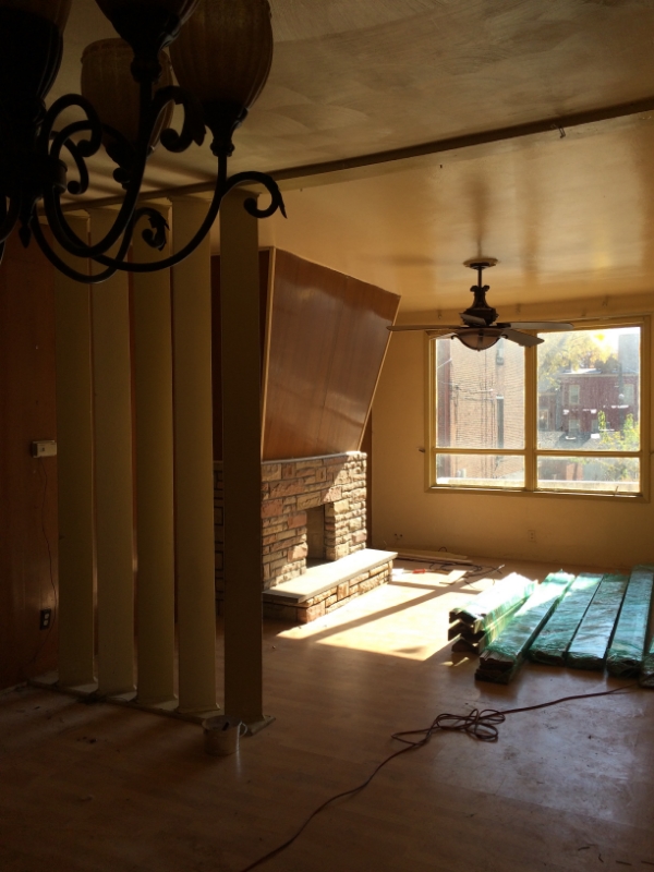
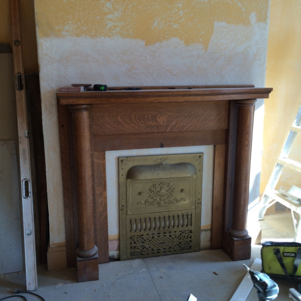
The second floor build out is also coming along. The master bath is comfortable , but kind of small . I am still getting used to smaller spaces. Life in suburbia was so much more breathable. The laundry room and walk in closet is built out. The only significant change to the master bedroom will be the installation of a mantle. The fireplace in the master bedroom was dry walled over at some stage in it's life. The pic below has a long piece of plywood in front of it.
I didn't want to open up this fireplace. That can be a can or worms in this old house. But I like the idea of the fireplace in the master. I found a mantle that came with a gas insert and summer cover. The gas insert was made by the Dawson Brothers at the turn of the century. So now it is a fake fireplace. Anyway, it needs to be finished out, but in the mean time I think it looks really nice.
The third floor kids bath seems very spacious as we enclosed the weird opening of the original space.

The only change to my office was the removal of the slider. We put in a french door that has as much glass as possible to take advantage of the wonderful views of downtown Pittsburgh.
That's it for now!
See you...
Christina
Happy exciting new year! My house is progressing. I am beginning to see how it will be translated into a beautiful living space. The demo is just about done and construction has begun. One of the main reasons I purchased this house was it's layout. Not much needs to be changed in terms of bathroom and kitchen utility placement. Walls have to be created and some spaces opened up a bit. But that is about it in terms of major construction. The first floor was pretty much an open plan. But the living room looks much larger without the mammoth fireplace.


I wish the original mantel was in place. But it is gone like most of the special features of the house. I found a vintage marble mantel at Construction Junction that I really like. It definitely isn't Victorian, but I think it will work just fine. This is the only photo I have, before it was dismantled. By the way, I wish there was a Construction Junction in NY, it is really what House Wreckers in Stamford, CT used to be like. Everything pulled from old houses. The ultimate recycling. There are many treasures to be found. It just takes patience.

Back to the layout. The living and dining will be designed into an airy, but warm environment. The kitchen and dining area opened up very nicely. The kitchen used to feel like it was on a back porch. It may have been in it's former life. But now it will be completely integrated.

The kitchen faces north. Not only did we put in a larger window, but a skylight will be installed to bring in more light.
We will save the staircase paneling where we can. But there looks like there were about ten coats of paint on it. So stripping all that paint was enormous.

.
The newel post looks great. It came out very nicely. Eventually, I would like to see it in a very dark stain.
Well that's it for now. Hope you also are seeing the progress of this design project! I know it looks daunting, but it is really coming along!
See you...
Christina
The interior design concept of Senti Restaurant came directly from the heart of the owners. Franco Braccia, a native Italian, spoke of the elegant restaurants of much of his early life in Venice. Annette Ishida, Franco's lovely wife and my very talented sister, helped translate and direct her own ideas into the project. The result is unique and completely fresh. Cozy, modern, quiet conversations, gallery like and drama were descriptions on the design table. They may seem like contradictions, but each idea was incorporated into the final product. So a great shout out to the Trib for noticing Senti's design!

Who makes the most glamorous, finest quality wallpaper? Far ahead of anyone is Phillip Jeffries. You can go completely understated with their soft fabric wall covering or over the top glam with their glowing gold striations paper. We went for the "look at me- I'm gorgeous" in designing Senti Restaurant and Wine Bar. Located in the hippest part of town, Lawrenceville, Senti is special place with special food. More on the fabulous Senti in an upcoming post. Today we celebrate Phillip Jeffries for profiling us in their Designer Installs!

We used the wallpaper at the base of the bar to accentuate the entire area. We wanted it to glow. It has a lacquered look, but it is actually a vinyl paper. Works perfectly!
See you...
Christina
It's always great being in NYC. Now I notice it more than ever after moving to Pittsburgh. So I am back in NY visiting with clients, sourcing new fabrics and furniture and visiting with friends. It was a whirlwind that ended at the NYNOW show. The day was cold and snowy. Definitely reflected my decorating mood. While everyone was talking about color, I noticed all the soft colors and sparkly accessories.
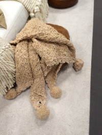
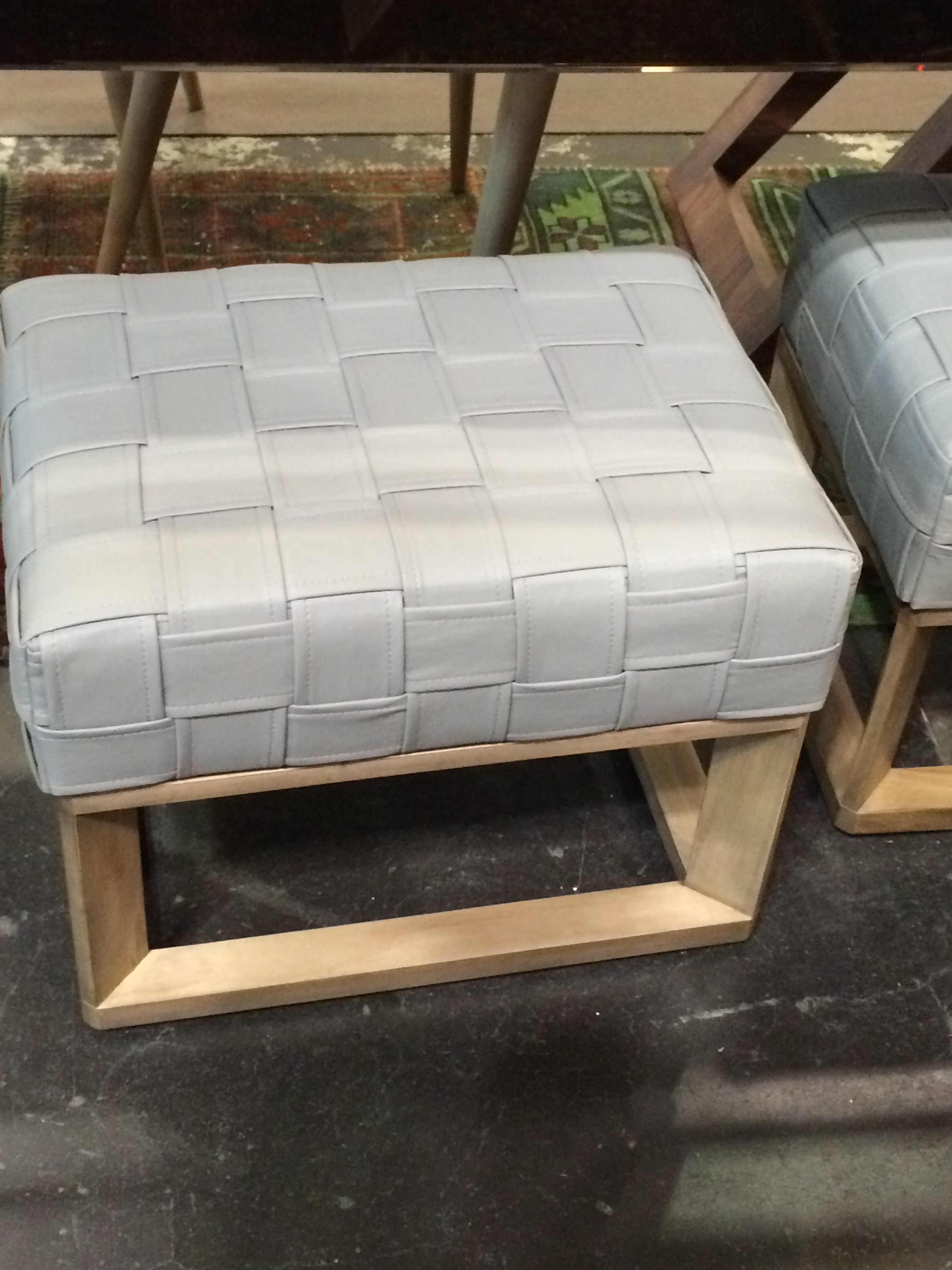
Chunky throws and upholstery for a chic living room
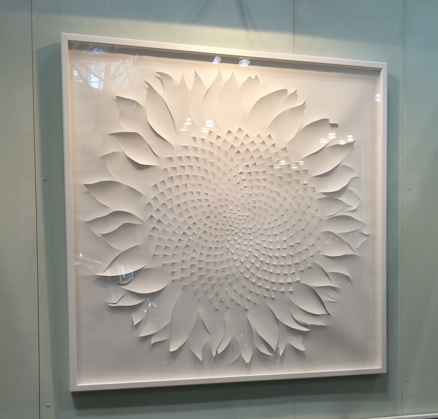
Monochrome colors in Art . Decorating for several spaces- A quiet physician's office, a young hip couple who embraces Andy Warhol's birth place of Pittsburgh, to a a classic mom's NYC master bedroom.


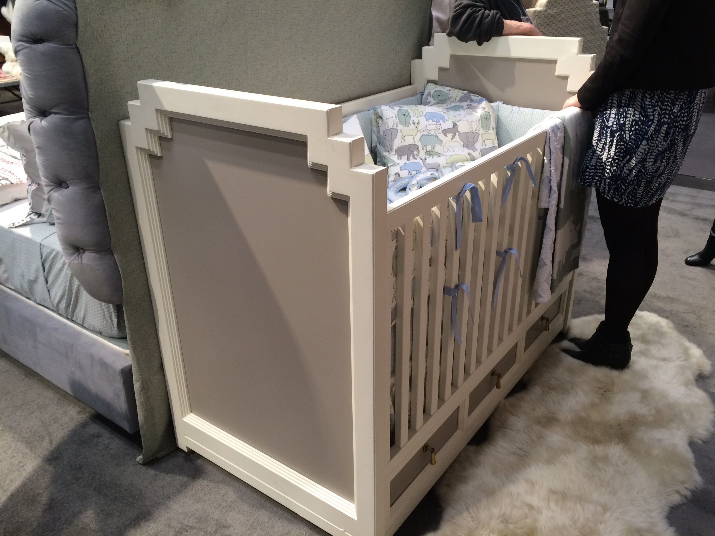
I'm always on the look out for what's new in baby nurseries. Great crib and a funky big sister's chair.
I would love these dishes for my new place in Pittsburgh.

Last stop was this Japanese vendor who has the most delicate little loves. A mobile of sorts. Time to fly home..

See you...
Christina
We are finishing a baby's nursery inspired by beach cabanas! Oh Summer is leaving us!


The room is very light and airy. We chose window treatments that were very similar to these.

We used this fresh Newport Cottages crib. The fabric panels on either side of the crib can be covered in any fabric of our choice and are completely removable for reupholstery.

We chose this striped fabric for the panels in the crib.

We chose this bookshelf from Newport. It was painted white on the outside. The inside back wall was painted aqua.

A nice accessory for the bookshelf would be this cute frame from Cici Crib .

For the bedding we did a cute crib skirt, fitted sheet and toddler blanket. The skirt is a seersucker orange with a fine wale cordoroy border.The fitted sheet is an aqua dot. Instead of a bumper we accessorized with a toddler blanket has the same outer fabric as the skirt, but lined with super soft minky. All custom made by Bebe Chic.

This area rug would look nice.

I would love to finish off the nursery with this piece of art. Framed in weathered driftwood, it is just perfect.

Happy Summer!
Oh just a note that Wee Westchester did a great little post about us on their very cool blog. Thanks Wee Westchester!
See you...
Christina
Quiet lavender was the request from a really nice client for her second daughter's nursery. She had most of the furniture from her first daughter, but she wanted to make the new baby's nursery special. We focused on the longevity of the decor. She knows how quickly her daughter grows up, so pieces were chosen carefully. We anchored the space with a really soft carpet and playful wallpaper for over the bead board.

The wallpaper was from Stark and the carpet came from the Sanford Hall showroom in NYC.


The side table will eventually go next to a bed when her daughter grows out of the crib. But for now we needed crib bedding. We chose a sweet set by Annette Tatem.

The lamp is one of a pair that will eventually be placed on the dresser(that is currently used as a changer). It is a simple vintage crystal lamp that we had trimmed in the most beautiful lilac linen.

We chose this delightful turn of the century print of girls playing that we framed. It is just so sweet.

A friend purchased a clock from Cici Crib for the room.

My client tells me that people notice the ceiling fixture first, when they enter the room. I hope it brings sweet dreams to the little one....

The window treatments were made from the most beautiful linen from Rogers & Goffigon in Greenwich, CT.

The ties are just perfect.

We also made an embroidered letter pillow from the linen.

Another whimsical picture is waiting to be hung in the room. We would like to put it over the changer, but curious little hands will cause us to move it to a temporary location.

See you..
Christina
I got a call from a dad who wanted to do a surprise nursery for his wife and new baby daughter. Both mother and daughter were having a bit of a rough go, and were in the hospital when he called me. I could hear his worry and love for his family over the phone. His wife admired a little girl's room, that I had decorated and blogged about. There was no one to make design decisions. He wanted a nursery like the little girl's bedroom and it had to be pink. Be positive and move quickly forward. We got much of the room together in 6 weeks. It was entirely custom. A huge feat, which I must really thank my vendors for making such accommodations. It was a nursery that would grow into the little girl's bedroom. The changer would be very temporary. They needed adequate storage and a comfortable glider to feed the baby.
This was the room before...


I decided not to wallpaper the entire room, as the wall's quirky angles would hinder the look of the paper. We did one wall. It looked like an outline of a house. Perfect. I chose a sunny yellow crib to welcome the little one home.


This very traditional armoire looks a bit more transitional, when we added the lattice fabric. It will be nicely centered against the wall when additional muscle arrives. It is a solid piece.


So sweet...

It was really a very rewarding job. Baby is just thriving and I've gotten to finally know the lovely mom.
See you...
Christina
A very nice family came to visit the shop in the latter part of June. The little boy was just a complete sparkle of a kid. Having only boys myself, I so appreciate the idiosyncracies of boys. He loves airplanes, trains, big trucks, loud construction equipment, etc.. The family was moving to Westchester from NYC in about 2 weeks time. They needed to have a room ready for their little boy, on moving day. He was leaving his crib behind and needed a big boy bed. New neighborhood, new house, new bed. We needed to work quickly. Ofcourse, we had a holiday weekend in between. Adds a little more stress to the equation. This is the room when I first saw it. A classic bedroom from a house built in the 1920's.

The couple really wanted wallpaper. We chose this Ralph Lauren paper..

The company did a quick ship on the artwork..

The window treatments just couldn't be done in time. Obviously, panels would overwhelm the windows. I really didn't want to do standard shades or romans. The windows are quite low to the floor. Any kind of cord is an issue. We chose a roller roman shade. It is a new shade, that we are beginning to use. No outside cords. They will be ready by the end of July. The flush mount light fixture is also back ordered, but will be in shortly. Made of glass, it will give off ample light.

The room was ready for the little boy..


I was there to see the excitement on the little boy's face. Some really good perks of my job!
See you...
Christina
I posted about a little girl's bedroom I was working on in April. It was the room with the poodle lamp. I will show it shortly, as we are still waiting for a few key items. Mainly the poodle lamp itself. Backordered since April, the waiting is driving me crazy. We also needed a very small sofa. Not really a loveseat, more like a sofette. Something so very petite, but can fit an adult as well as a child. There are really no little sofas out there that work for a child. Why is furniture so oversized?? We liked the Jonathon Adler junior lampert sofa. But the dimensions are for a child. It is tiny and very uncomfortable for an adult.

So we changed the dimensions, and angled the seat to make it more comfortable. We had it made by a great workroom in Mount Vernon, NY. I got a little tour of the place. From carpentry to upholstery a piece which starts out on paper comes to life...


So many interesting custom made pieces. Much of their work is for hotels and restaurants...


Then there was our sofette..


And finally in the room. Perfect for a little girl and her mom...

See you... Christina
There are times a designer misses the concept of what a client is looking for. This is a fine example. I thought the customer would be as excited as I was about this concept. Great clients. Wrong concept. It mixes touches of blues and oranges with a neutral cappuccino color. The carpet in this NYC apartment is a Stark neutral. It will remain. The customer is pretty firmly traditional, but would like a more modern nursery. The carpet looks like this..

I wanted to use a grasscloth wallcovering that had a delicate orange trellis.

After I chose it, I saw it was used in the Kips Bay showhouse, in a very large room. As you can see the pattern is not overwhelming.


I designed this long changer finished in white lacquer. It had closed storage on the right side, drawers in the center and a hamper on the left side. Each piece would come apart and be completely painted. This would allow for future flexibility. Later on, one could use the hamper and dresser in different parts of the room, for example.

On top of the changer we would affix this standard tray.

The crib is very clean, but still maintains it's traditional roots. It would be entirely in white.

The glider is the classic glider that I have in the shop slip covered in a linen. The bedding would have dashes of blue and orange. Pic of the side of bumper is below.

Fabrics would be a thin orange stripe piping and ties with white matelasse and Annette Tatem soleil orange fabric that is separated by a large ric rac lace.

I wanted to use a 7' round rug that would achor the room.If the baby was a girl it would be this one.

A boy...

Possible artwork. Vintage educational posters...

Although the client decided not to go in this direction. The ideas will remain in the Cici Crib library....
See you...
Christina
A mom asked me for help in finishing the decorating of her daughter's room. She already purchased the furniture and some fabric and wallpaper. Now she asks me to make it all work. This can be a very difficult task and sometimes it can really work out smoothly. Her new furniture is fairly modern, but the new wallpaper is pretty traditional. Here are her items. The top piece is the wallpaper and the fabrics below the wallpaper are all very raspberry.

I chose some fabric, trim and carpet to pull it together. The new carpet to me is so very important. The client is unfortunately on the fence about it.

I would really like to use this lamp that I did for another customer. This client loved the lamp. She described it as a girl in a ball gown..

I chose some additional pieces that would complement the client's pieces.
A great ball chair...

And a nice bench for the foot of the bed...

There is a dressing room that is sandwiched between the bedroom and bathroom. It is somewhat small and has a built in vanity with a green marble top.

It is a great little space that right now looks so ordinary. I want it to pop. Like opening a jewelry box of fun little trinkets. I want it to to be Dorothy Draper inspired. I chose this crazy fun wallpaper..

I love this Frances Elkins chair

It's definitely an interesting and challenging project. See you...
Christina
I have been working with a lovely client who subtly shows her refined Texas roots and her flair as a jewelry designer. We have been working on her daughter's room. The design is a bit in the transitional phase. The toddler is quickly moving into the world of a big girl. We planned for a future bed, nightstand and desk. For now it works for her age. She loves to sit and read with her mom on the double glider. She loves her crib. And she loves her dollhouse. We wanted a timeless design that the little girl could grow with. The carpet is a delicate pink and green lattice by Schumacher.


There was much discussion about the window treatments. The client wanted very soft formal treatments. We exactly translated her wish. I so love the chandelier that was chosen. When she saw the electrican putting toThe client had to take out her jewelry making tools to put it together. It is perfect.

For the window treatments, we decided on a Hinson & Co. fabric and splurged a bit on the Schumacher trim.

We did a fairly large bulletin board that will eventually hang over a desk.

I love the pushpins the client found. Made from vintage earrings...

The bookshelf was custom Newport Cottages. The metal fairies that flank the venetian mirror are vintage. I am not sure where the fairies came from. Maybe they were a part of a weather vane. I purchased them from an antique mall in Ohio. It is the unexpected element in the room.


On the bookshelf are crystal lamps from the '50s. We purchased the vanity tray on ebay. It reminded the client of her grandmother. The vintage porcelain southern bell is actually a music box.

For now it is room for a little girl. I will take more pics of this room as it evolves into a room for a big girl.
See you..
Christina