The house is starting to feel more like a house than a construction site. Well sort of anyway. Walls are being smoothed out. Tile is down. The wood floorand entry tile on the main floor has been laid.

In keeping with my concept of a light, bright ,warm space, I decided on a white washed oak floor. There are purposeful imperfections- a shabby chic floor for sure. I didn't want the floor to look shiny new next to the well worn staircase. I know the white floor is gutsy design decision in this historic district. It will be laid next to the staircase which will be stained as dark as possible. I love that contrast!
The lovely entrance floor above, a beautiful marble from Italy, is a Walker Zanger tile. I purchased the tile at Tile and Designs in Shadyside. Their selection of tile is exquisite.
Most of the trim and casings in the house were removed after the many renovations that occurred over its life. There is a bit left. The pic below shows the original casing that is in the process of being stripped and sanded.
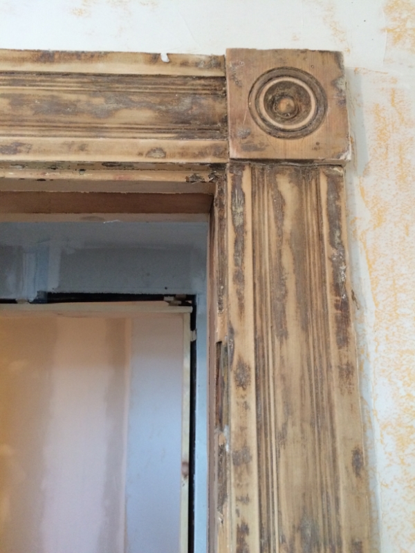
I found new casing and rosettes at Allegheny Millworks in Pittsburgh. It isn't exact match, but I felt it was close enough. I can just hang outand check out all their beautiful woodwork at Allegheny Millworks. I love that place.

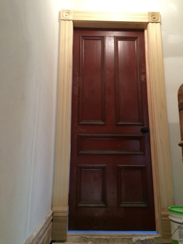
I found this beautiful cherry trim for the first floor. It's chunky and gorgeous.

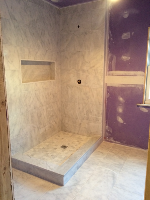
The master bath tiling is complete. It is all in carrera marble.
Exterior work is going on as well. The new siding is going up on the back of the house! I decided to use Hardie Plank siding. It's a great alternative to wood. I chose the Hardie color of cobblestone for the siding with white trim. Here is a pic from before. Notice the very dangerous balcony. The house inspector refused to step on it.
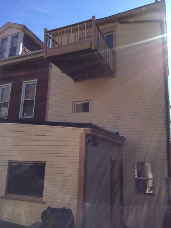
The balcony is now a Juliette balcony and all siding and windows are new.

Well that's about it for now. Thanks for looking.
See you...
Christina


